| NYT | 538 | HuffPost | PW | PEC | DK | Cook | Roth | |
|---|---|---|---|---|---|---|---|---|
| Win Prob | 85% | 71% | 98% | 89% | >99% | 92% | Lean Dem | Lean Dem |
12 Hierarchical Models
Hierarchical models are useful for quantifying different levels of variability or uncertainty. One can use them using a Bayesian or frequentist framework. However, in the frequentist framework, hierarchical models often extend a model with fixed parameters by treating those parameters as random, leading to a formulation with two distributions that resemble a prior and a sampling distribution in the Bayesian framework. This makes the resulting summaries very similar or even equal to what is obtained with a Bayesian context. A key difference between the Bayesian and the frequentist hierarchical model approach is that, in the latter, we use data to construct priors rather than treat priors as a quantification of prior expert knowledge. In this section, we illustrate the use of hierarchical models by describing a simplified version of the approach used by FiveThirtyEight to forecast the 2016 election.
12.1 Case study: election forecasting
After the 2008 elections, several organizations besides FiveThirtyEight launched their own election forecasting teams that aggregated polling data and used statistical models to make predictions. However, in 2016, many forecasters greatly underestimated Trump’s chances of winning. The day before the election, the New York Times reported1 the following probabilities for Hillary Clinton winning the electoral college, and thus the presidency:
Note that the Princeton Election Consortium (PEC) gave Trump less than 1% chance of winning, while the Huffington Post gave him a 2% chance. In contrast, FiveThirtyEight had Trump’s probability of winning at 29%, substantially higher than the others. In fact, four days before the election, FiveThirtyEight published an article titled Trump Is Just A Normal Polling Error Behind Clinton2.
So why did FiveThirtyEight’s model perform so much better than others? How could PEC and Huffington Post get it so wrong if they were using the same data? In this chapter, we describe how FiveThirtyEight used a hierarchical model to correctly account for key sources of variability and outperform all other forecasters. For illustrative purposes, we will continue examining our popular vote example. In the final section, we will describe the more complex approach used to forecast the electoral college result.
12.2 Systematic polling error
In the previous chapter, we computed the posterior probability of Hillary Clinton winning the popular vote with a standard Bayesian analysis and found it to be very close to 100%. However, FiveThirtyEight gave her a 81.4% chance3. What explains this difference? Below, we describe the systematic polling error, another source of variability, included in the FiveThirtyEight model, that accounts for the difference.
After elections are over, one can look at the difference between the polling averages and the actual results. An important observation that our initial models did not take into account is that it is common to see a systematic polling error that affects most pollsters in the same way. Statisticians refer to this as a bias. The cause of this bias is unclear, but historical data show it fluctuates. In one election, polls may favor Democrats by 2%, the next Republicans by 1%, then show no bias, and later favor Republicans by 3%. In 2016, polls favored Democrats by 1-2%.
Although we know this systematic polling error affects our polls, we have no way of knowing what this bias is until election night. So we can’t correct our polls accordingly. What we can do is include a term in our model that accounts for the variability.
12.3 Mathematical representations of the hierarchical model
Suppose we are collecting data from one pollster, and we assume there is no systematic error. The pollster collects several polls with a sample size of \(N\), so we observe several measurements of the spread \(Y_1, \dots, Y_J\). Suppose the real proportion for Hillary is \(p\) and the spread is \(\theta\). The urn model theory tells us that these random variables are approximately normally distributed, with expected value \(\theta\) and standard error \(2 \sqrt{p(1-p)/N}\):
\[ Y_j \sim \mbox{N}\left(\theta, \, 2\sqrt{p(1-p)/N}\right) \]
We use \(j\) as an index to label polls, so \(Y_j\) corresponds to the spread reported by the \(j\)th poll.
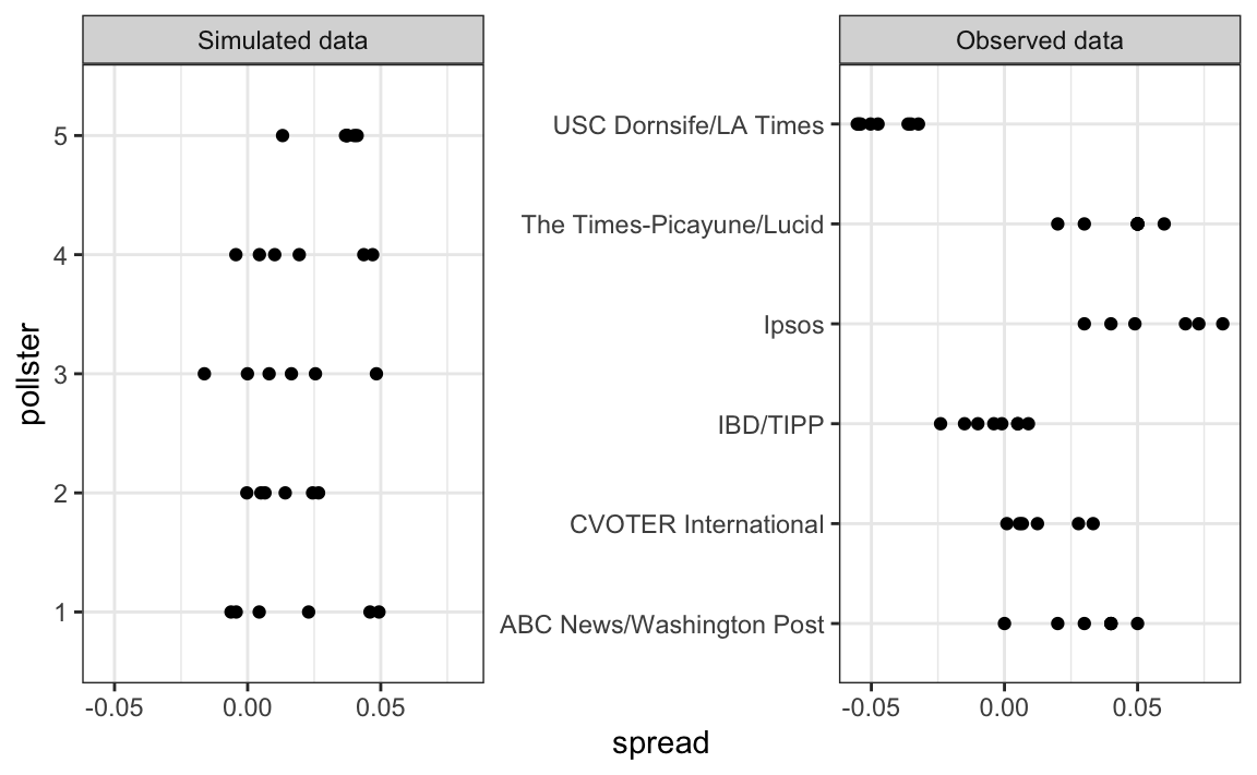
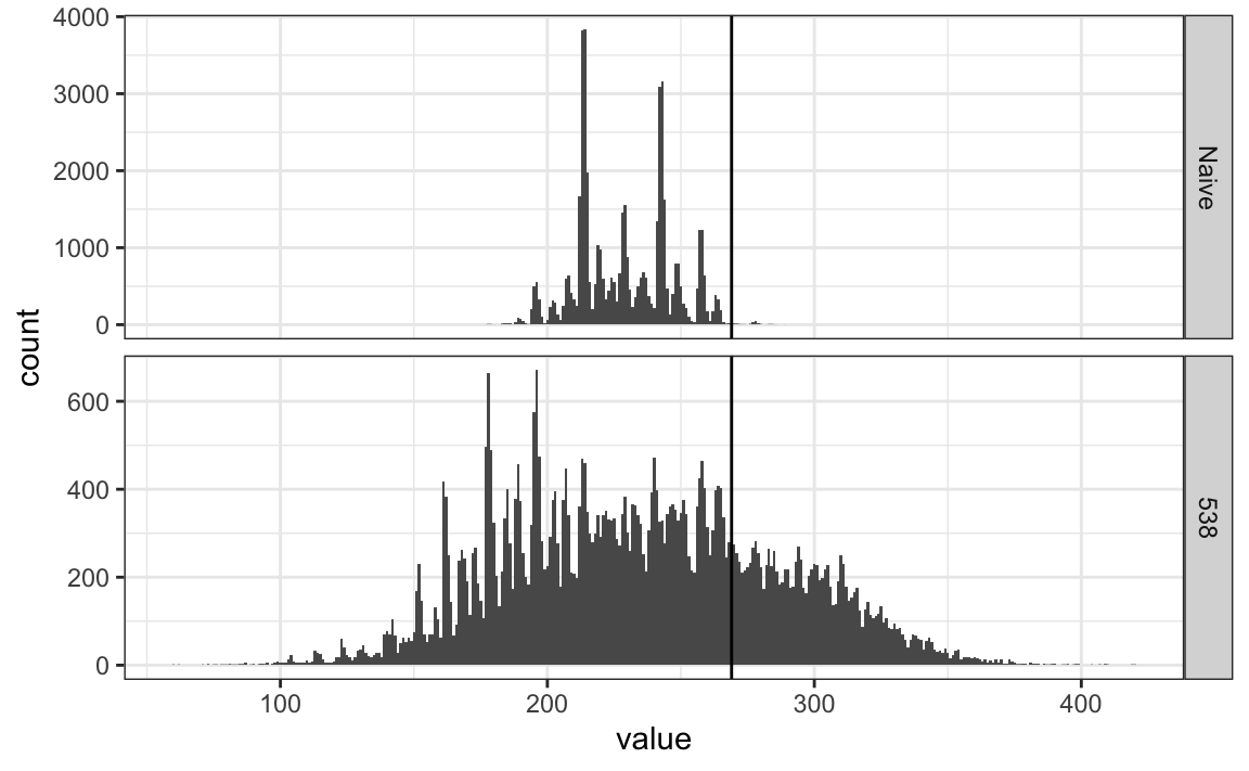
Below is a simulation for six polls assuming the spread is 2.1% and \(N\) is 2,000:
Now, suppose we have \(J=6\) polls from each of \(I=5\) different pollsters. For simplicity, let’s say all polls had the same sample size \(N\). The urn model tells us the distribution is the same for all pollsters, so to simulate data, we use the same model for each:
As expected, the simulated data does not really seem to capture the features of the actual data because it does not account for pollster-to-pollster variability:
To fix this, we need to represent the two levels of variability, and we need two indices, one for the pollster and one for the polls each pollster takes. We use \(Y_{ij}\) with \(i\) representing the pollster and \(j\) representing the \(j\)th poll from that pollster. The model is now augmented to include pollster effects \(h_i\), referred to as house effects by FiveThirtyEight, with standard deviation \(\sigma_h\):
\[ \begin{aligned} h_i &\sim \mbox{N}\left(0, \sigma_h\right)\\ Y_{ij} \mid h_i &\sim \mbox{N}\left(\theta + h_i, \, 2\sqrt{p(1-p)/N}\right) \end{aligned} \]
To simulate data from a specific pollster, we first need to draw an \(h_i\), and then generate individual poll data after adding this effect. In the simulation below we assume \(\sigma_h\) is 0.025 and generate the \(h\) using rnorm:
The simulated data now looks more like the observed data:
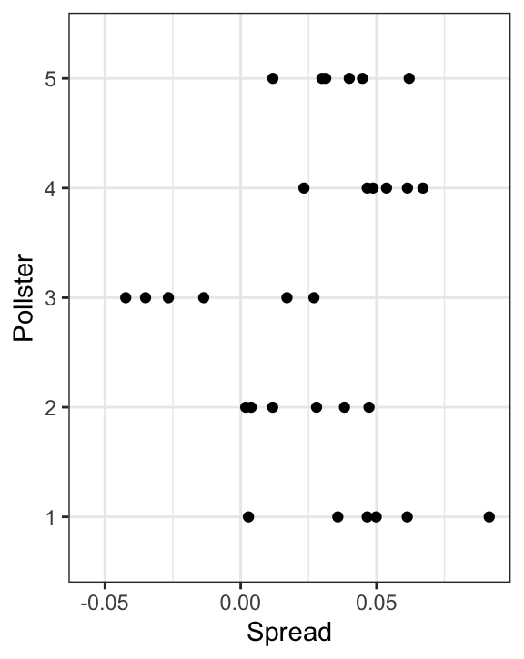
Note that \(h_i\) is common to all the observed spreads from pollster \(i\). Different pollsters have different \(h_i\), which explains why we can see the groups of points shift up and down from pollster to pollster.
Now, in the model above, we assume the average house effect is 0: we generate it with rnorm(I, 0, 0.025). We think that for every pollster biased in favor of one party, there is another one in favor of the other in a way that the error averages out when computing the average across all polls. In this case, the polling average is unbiased. However, as mentioned above, systematic polling error is observed when we study past elections.
We can’t observe this bias before election day, but if we collect historical data, we see that the average of polls misses the actual result by more than what is predicted by models like the one above. We don’t show the data here, but if we took the average of polls for each past election and compared it to the actual election night result, we would observe a difference with a standard deviation of between 2% and 4%.
Although we can’t observe the bias for an upcoming election, we can define a model that accounts for its variability. We do this by adding another level to the model as follows:
\[ \begin{aligned} b &\sim \mbox{N}\left(0, \sigma_b\right)\\ h_j \mid \, b &\sim \mbox{N}\left(b, \sigma_h\right)\\ Y_{ij} | \, h_j, b &\sim \mbox{N}\left(\theta + h_j, \, 2\sqrt{p(1-p)/N}\right) \end{aligned} \] This model captures three distinct sources of variability:
- Systematic error across elections, represented by the random variable \(b\), with variability quantified by \(\sigma_b\).
- Pollster-to-pollster variability, often called the house effect, is quantified by \(\sigma_h\).
- Sampling variability within each poll, which arises from the random sampling of voters and is given by \(2\sqrt{p(1-p)/N}\), where \(p = (\theta + 1)/2\).
Failing to include a term like \(b\), the election-level bias, led many forecasters to be overly confident in their predictions. The key point is that \(b\) changes from one election to another but remains constant across all pollsters and polls within a single election. Because \(b\) has no index, we cannot estimate \(\sigma_b\) using data from only one election. Furthermore, this shared \(b\) implies that all random variables \(Y_{ij}\) within the same election are correlated, since they are influenced by the same underlying election-level bias.
12.4 Computing a posterior probability
Now, let’s fit a model like the above to data. We will use one_poll_per_pollster data defined in Chapter 10:
one_poll_per_pollster <- polls |> group_by(pollster) |>
  slice_max(enddate, n = 1, with_ties = FALSE) |>
  ungroup()
Here, we have just one poll per pollster, so we will drop the \(j\) index and represent the data as before with \(Y_1, \dots, Y_I\). As a reminder, we have data from \(I=\) 20 pollsters. Based on the model assumptions described above, we can mathematically show that the average \(\bar{Y}\)
y_bar <- mean(one_poll_per_pollster$spread)has expected value \(\theta\); thus, in the long run, it provides an unbiased estimate of the outcome of interest. But how precise is this estimate? Can we use the observed sample standard deviation to construct an estimate of the standard error of \(\bar{Y}\)?
It turns out that, because the \(Y_i\) are correlated, estimating the standard error is more complex than what we have described up to now. Specifically, we can show that the standard error can be estimated with:
As mentioned earlier, estimating \(\sigma_b\) requires data from past elections. However, collecting this data is a complex process and beyond the scope of this book. To provide a practical example, we set \(\sigma_b\) to 3%.
We can now redo the Bayesian calculation to account for this additional variability. This adjustment yields a result that closely aligns with FiveThirtyEight’s estimates:
12.5 Predicting the electoral college
Up to now, we have focused on the popular vote. However, in the United States, elections are not decided by the popular vote but rather by what is known as the electoral college. Each state gets a number of electoral votes that depends, in a somewhat complex way, on the population size of the state. In 2016, California, the largest state, had 55 electoral votes, while the smallest seven states and the District of Columbia had 3.
With the exception of two states, Maine and Nebraska, electoral votes in U.S. presidential elections are awarded on a winner-takes-all basis. This means that if a candidate wins the popular vote in a state by even a single vote, they receive all of that state’s electoral votes. For example, winning California in 2016 by just one vote would secure all 55 of its electoral votes.
This system can lead to scenarios where a candidate wins the national popular vote but loses the electoral college, as was the case in 1876, 1888, 2000, and 2016.
The electoral college was designed to balance the influence of populous states and protect the interests of smaller ones in presidential elections. As a federation, the U.S. included states wary of losing power to larger states. During the Constitutional Convention of 1787, smaller states negotiated this system to ensure their voices remained significant, receiving electors based on their senators and representatives. This compromise helped secure their place in the union.
Organizing the data
We are now ready to predict the electoral college result for 2016. We start by creating a data frame with the electoral votes for each state:
results <- results_us_election_2016 |> select(state, electoral_votes)We then aggregate results from polls taken during the last weeks before the election and include only those taken on registered and likely voters. We define spread as the estimated difference in proportion:
polls <- polls_us_election_2016 |>
  filter(state != "U.S." & enddate >= "2016-11-02" &  population != "a") |>
  mutate(spread = (rawpoll_clinton - rawpoll_trump)/100)
If a pollster ran more than one poll in this period, we keep only the latest.
polls <- polls |>
  arrange(population, desc(enddate)) |>
  group_by(state, pollster) |>
  slice(1) |>
  ungroup()
Weighted averages
Instead of simply averaging polls, FiveThirtyEight assigns weights to pollsters based on a letter grade, stored in the grade column. This grade reflects the pollster’s past accuracy and reliability. We generate a table with grades and weights for future use:
weights <- data.frame(grade = unique(sort(polls$grade))) |>
  mutate(weight = seq(0.3, 1, length = length(grade)))
FiveThirtyEight considers various factors when determining the weight of each poll, including the proximity to election day. However, for simplicity, this analysis focuses solely on pollster grades.
Higher-graded pollsters are assigned more weight in the model, giving their results greater influence, while lower-graded or less reliable pollsters contribute less. This is achieved mathematically through a weighted average:
\[ \bar{Y}_w = \frac{\sum_{i=1}^N w_i Y_i}{\sum_{i=1}^N w_i} \]
where \(Y_i\) represents the result from pollster \(i\), \(w_i\) is the weight assigned to pollster \(i\), and \(N\) is the total number of pollsters. We add the \(w\) subscript to \(\bar{Y}_w\) to denote that it is a weighted average.
To understand this intuitively, think of the weights as fractions of a full data point. For example, if the maximum weight is 1, a pollster with a weight of \(0.5\) contributes half as much as a fully trusted pollster, while a weight of \(0.25\) can be interpreted as contributing a quarter of a poll.
We use a similar equation to estimate the standard deviation:
\[ s_w = \sqrt{\frac{\sum_{i=1}^N w_i (Y_i - \bar{Y}_w)^2}{\frac{N-1}{N}\sum_{i=1}^N w_i}} \]
We can use the formula learned in Section 7.4 to derive the standard error for our weighted estimate:
\[ \mathrm{SE}[\bar{Y}_w] = \frac{\sigma_h}{\sqrt{N_{\mbox{eff}}}} \mbox{ with } N_{\mbox{eff}} = \frac{\left(\sum_{i=1}^N w_i\right)^2}{\sum_{i=1}^N w_i^2} \]
Because it plays the same role as the sample size \(N\) in the formula for the unweighted standard error of the sample average, \(N_{\mbox{eff}}\) is referred to as the effective sample size. Note that it is equal to \(N\) when all the weights are 1 and gets smaller the closer the weights get to 0.
We now use these equations to compute the weighted averages:
We assume the pollster or house effect standard deviation \(\sigma_h\) is the same across states and take the median of those based on an effective sample size larger than or equal to 5:
In the Linear Models section of the book, we explore a more statistically rigorous method for estimating standard deviations.
Next, we use the command left_join to combine the results data frame containing the electoral votes for each state and the polls data frame containing the summary statistics:
results <- left_join(results, polls, by = "state")Constructing priors
To make probabilistic arguments, we will use a Bayesian model. To do this, we need means and standard deviations for the prior distribution of each state. We will assume a normal distribution for the prior and use the 2012 election results to construct prior means. Specifically, we compute the difference between Democrat (Obama) and Republican (Romney) candidates:
results <- results_us_election_2012 |>
  mutate(theta_0 = (obama - romney)/100) |>
  select(state, theta_0) |>
  right_join(results, by = "state")
As done for the popular vote prior, we assign a prior standard deviation of 5% or \(\tau=0.05\).
results$tau <- 0.05Computing posterior distributions
With the prior distribution established, we can calculate the posterior distributions for each state. In some states, the outcome is considered highly predictable, with one party (Republican or Democrat) almost certain to win. As a result, there are no polls conducted in these states. In such cases, the posterior distribution remains the same as the prior distribution.
Monte Carlo simulation
We then use Monte Carlo to generate 50,000 election day results \(\theta\) for each state. For each iteration, we examine \(\theta\). If \(\theta<0\), Trump receives all the electoral votes for that state in that iteration. We assume that the poll results from each state are independent.
This model gives Trump less than a 1% chance of winning, similar to the prediction made by the Princeton Election Consortium. We now know it was quite off. What happened?
The model above ignores the possibility of a systematic polling error and, incorrectly, assumes the results from different states are independent. To correct this, we assume that the systematic error term has a standard deviation of 3%. For each iteration, we generate systematic error at random and add it to the result for all states.
This gives Trump almost a 25% change of winning, which turned out to be a much more sensible estimate, and closer to the prediction made by FiveThirtyEight of 29%.
Regional correlation
Polling faced significant criticism after the 2016 election for “getting it wrong”. However, the polling average actually predicted the final result with notable accuracy, as is typically the case.
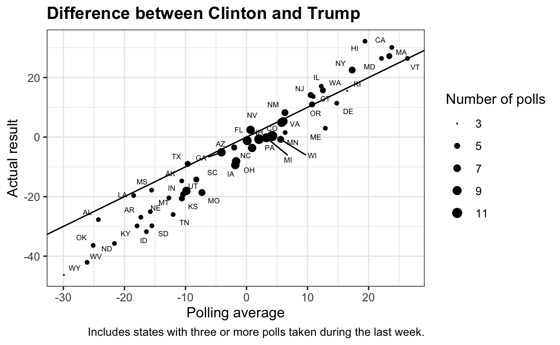
In fact, the polling average got the sign of the difference wrong in only five out of the 50 states.
tmp |> filter(sign(spread) != sign(avg)) |>
select(state, avg, spread) |>
mutate(across(-state, ~round(.,1))) |>
setNames(c("State", "Polling average", "Actual result"))
#> State Polling average Actual result
#> 1 Florida 0.1 -1.2
#> 2 Pennsylvania 2.0 -0.7
#> 3 Michigan 3.3 -0.2
#> 4 North Carolina 0.9 -3.7
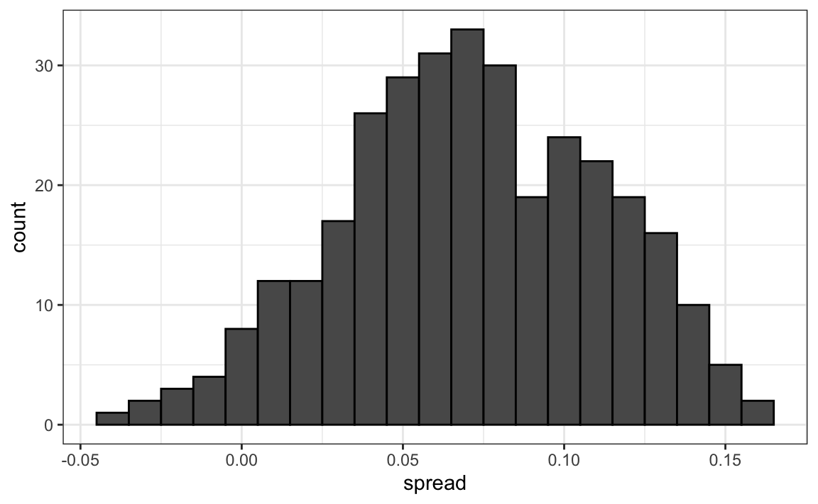
#> 5 Wisconsin 5.6 -0.8Notice that the errors were all in the same direction, suggesting a systematic polling error. However, the scatter plot reveals several points both above and below the identity line, indicating deviations from the assumption of uniform bias across all states. A closer inspection shows that the bias varies by geographical region, with some areas experiencing stronger effects than others. This pattern is further confirmed by plotting the differences across regions directly:
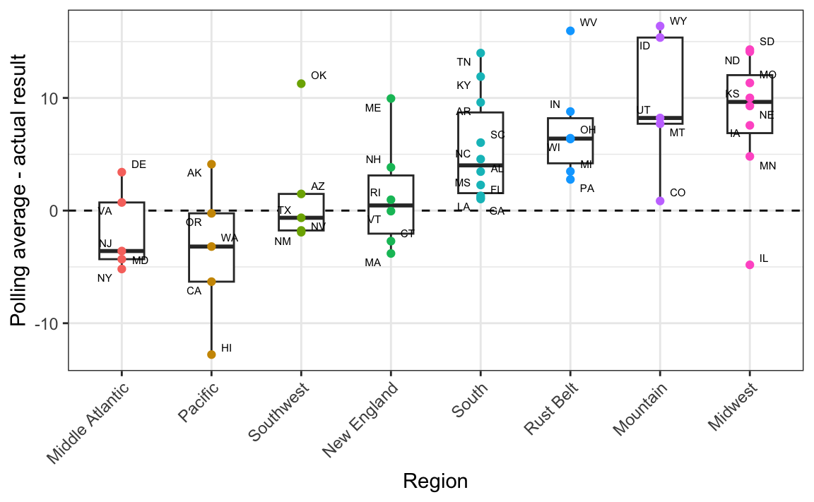
Advanced forecasting models, like FiveThirtyEight’s, recognize that systematic polling errors often vary by region. To reflect this in a model, we can group states into regions and introduce a regional error term. Since states within the same region share this error, it creates a correlation between their outcomes.
Final results
More sophisticated models also account for variability by using distributions that allow for more extreme events than a normal distribution. For example, a t-distribution with small degrees of freedom can capture these rare but impactful outcomes.
By incorporating these adjustments—regional errors, and heavy-tailed distributions—our model produces a probability for Trump similar to FiveThirtyEight’s reported 29%. Simulations reveal that factoring in regional polling errors and correlations increases the overall variability in the results.
12.6 Forecasting
Forecasters aim to predict election outcomes well before election day, updating their projections as new polls are released. However, a key question remains: How informative are polls conducted weeks before the election about the final outcome? To address this, we examine how poll results vary over time and how this variability affects forecasting accuracy.
To make sure the variability we observe is not due to pollster effects, let’s study data from just a single pollster:
one_pollster <- polls_us_election_2016 |>
  filter(pollster == "Ipsos" & state == "U.S.") |>
  mutate(spread = rawpoll_clinton/100 - rawpoll_trump/100)
Since there is no pollster effect, perhaps the theoretical standard error matches the data-derived standard deviation. But the empirical standard deviation is higher than the highest possible theoretical estimate:
Furthermore, the distribution of the spread does not look normal, as the theory would predict:
The models we have described include pollster-to-pollster variability and sampling error. But this plot is for one pollster, and the variability we see is certainly not explained by sampling error. Where is the extra variability coming from? The following plots make a strong case that it comes from time fluctuations not accounted for by the theory that assumes \(p\) is fixed:
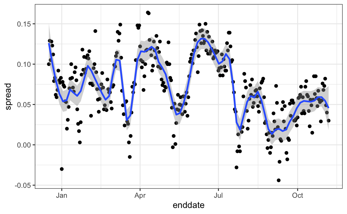
Some of the peaks and valleys in the data align with major events such as party conventions, which typically give candidates a temporary boost. If we generate the same plot for other pollsters, we find that these patterns are consistent across several of them. This suggests that any forecasting model should include a term to account for time effects. The variability of this term would itself depend on time, since as election day approaches, its standard deviation should decrease and approach zero.
Pollsters try to estimate trends from these data and incorporate them into their predictions. We can model the time trend with a smooth function and then use this to improve predictions. There is a variety of methods for estimating trends, which we discuss in Section 28.3 in the Machine Learning part of the book.
12.7 Exercises
1. Create this table:
Now, for each poll, use the CLT to create a 95% confidence interval for the spread reported by each poll. Call the resulting object cis with columns lower and upper for the limits of the confidence intervals. Use the select function to keep the columns state, startdate, enddate, pollster, grade, spread, lower, upper.
2. You can add the final result to the cis table you just created using the left_join function like this:
add <- results_us_election_2016 |>
  mutate(actual_spread = clinton/100 - trump/100) |>
  select(state, actual_spread)
cis <- cis |>
  mutate(state = as.character(state)) |>
  left_join(add, by = "state")
Now, determine how often the 95% confidence interval includes the election night result stored in actual_spread.
3. Repeat this, but show the proportion of hits for each pollster. Consider only pollsters with more than 5 polls and order them from best to worst. Show the number of polls conducted by each pollster and the FiveThirtyEight grade of each pollster. Hint: Use n=n(), grade = grade[1] in the call to summarize.
4. Repeat exercise 3, but instead of pollster, stratify by state. Note that here we can’t show grades.
5. Make a barplot based on the result of exercise 4. Use coord_flip.
6. Add two columns to the cis table by computing, for each poll, the difference between the predicted spread and the actual spread, and define a column hit that is true if the signs are the same. Call the object resids. Hint: Use the function sign.
7. Create a plot like in exercise 5, but for the proportion of times the sign of the spread agreed with the election night result.
8. In exercise 7, we see that for most states, the polls had it right 100% of the time. In only 9 states did the polls miss by more than 25% of the time. In particular, notice that in Wisconsin, every single poll got it wrong. In Pennsylvania and Michigan, more than 90% of the polls had the signs wrong. Make a histogram of the errors. What is the median of these errors?
9. We see that at the state level, the median error was 3% in favor of Clinton. The distribution is not centered at 0, but at 0.03. This is related to the general bias described in Section 12.2. Create a boxplot to see if the bias was general to all states or if it affected some states differently. Use filter(grade %in% c("A+","A","A-","B+") | is.na(grade)) to only include pollsters with high or unknown grades.
10. In April 2013, José Iglesias, a professional baseball player, was starting his career. He was performing exceptionally well, with an excellent batting average (AVG) of .450. The batting average statistic is one way of measuring success. Roughly speaking, it tells us the success rate when batting. José had 9 successes out of 20 tries. An AVG of .450 means José has been successful 45% of the times he has batted, which is rather high, historically speaking. In fact, no one has finished a season with an AVG of .400 or more since Ted Williams did it in 1941! We want to predict José’s batting average at the end of the season after players have had about 500 tries or at-bats. With the frequentist techniques, we have no choice but to predict that his AVG will be .450 at the end of the season. Compute a confidence interval for the success rate.
11. Despite the frequentist prediction of .450, not a single baseball enthusiast would make this prediction. Why is this? One reason is that they know the estimate has much uncertainty. However, the main reason is that they are implicitly using a hierarchical model that factors in information from years of following baseball. Use the following code to explore the distribution of batting averages in the three seasons prior to 2013, and describe what this tells us.
12. So is José lucky, or is he the best batter seen in the last 50 years? Perhaps it’s a combination of both luck and talent. But how much of each? If we become convinced that he is lucky, we should trade him to a team that trusts the .450 observation and is maybe overestimating his potential. The hierarchical model provides a mathematical description of how we came to see the observation of .450. First, we pick a player at random with an intrinsic ability summarized by, for example, \(\theta\). Then, we see 20 random outcomes with success probability \(\theta\). What model would you use for the first level of your hierarchical model?
13. Describe the second level of the hierarchical model.
14. Apply the hierarchical model to José’s data. Suppose we want to predict his innate ability in the form of his true batting average \(\theta\). Write down the distributions of the hierarchical model.
15. We are now ready to compute the distribution of \(\theta\) conditioned on the observed data \(\bar{Y}\). Compute the expected value of \(\theta\) given the current average \(\bar{Y}\), and provide an intuitive explanation for the mathematical formula.
16. We started with a frequentist 95% confidence interval that ignored data from other players and summarized just José’s data: .450 \(\pm\) 0.220. Construct a credible interval for \(\theta\) based on the hierarchical model.
17. The credible interval suggests that if another team is impressed by the .450 observation, we should consider trading José, as we are predicting he will be just slightly above average. Interestingly, the Red Sox traded José to the Detroit Tigers in July. Here are José Iglesias’ batting averages for the next five months:
| Month | At Bat | Hits | AVG |
|---|---|---|---|
| April | 20 | 9 | .450 |
| May | 26 | 11 | .423 |
| June | 86 | 34 | .395 |
| July | 83 | 17 | .205 |
| August | 85 | 25 | .294 |
| September | 50 | 10 | .200 |
| Total w/o April | 330 | 97 | .293 |
Which of the two approaches provided a better prediction?