3 Comparing Groups
So far, we have focused on summarizing the distribution of a single variable, describing its center, spread, and shape. In practice, however, one of the most common goals of data analysis is comparison: we want to know how one group differs from another, how a treatment compares to a control, or how outcomes vary across conditions. Comparing groups is often the first step toward uncovering relationships and understanding sources of variation.
The tools we developed for describing distributions—histograms, boxplots, and numerical summaries such as the mean and median—extend naturally to comparisons. By examining these summaries within subgroups or by comparing quantiles across distributions, we can reveal patterns that a single summary might conceal.
In this chapter, we explore two key techniques for comparing distributions:
- Quantile–quantile plots, which provide a systematic way to compare the shapes of two distributions, including how observed data differ from theoretical models such as the normal distribution.
- Stratification, which involves dividing data into meaningful subgroups and examining each distribution separately.
Together, these methods complete our descriptive toolkit, bridging the transition from exploring single variables to analyzing relationships between variables.
3.1 Quantile-quantile plots
A systematic way to compare two distributions is to compare their cumulative distribution functions (CDFs). A practical way to do this is through their quantiles.
For a proportion \(0 \leq p \leq 1\), the \(p\)-th quantile of a distribution \(F(x)\) is the value \(q\) such that \(F(q) = p\), or \(q = F^{-1}(p)\). For example, \(p = 0\) gives the minimum, \(p = 0.5\) gives the median, and \(p = 1\) gives the maximum.
The notation \(Q(p) = F^{-1}(p)\) or equivalently \(q_p = F^{-1}(p)\) is commonly used in textbooks to denote the \(p\)-th quantile of a distribution.
A quantile–quantile plot (qqplot) provides a visual way to compare two distributions, say \(F_1(x)\) and \(F_2(x)\), by plotting the quantiles of one distribution against the corresponding quantiles of the other. Specifically, if we define \[ Q_1(p_i) = F_1^{-1}(p_i) \quad \text{and} \quad Q_2(p_i) = F_2^{-1}(p_i) \] for a set of probabilities \(p_1, \dots, p_m\), then the qqplot is created by plotting the pairs \[ \{Q_1(p_i),\, Q_2(p_i)\}, \quad i = 1, \dots, m. \] A common choice for these probabilities is \[ p_i = \frac{i - 0.5}{n}, \quad i = 1, \dots, n, \] where \(n\) is the size of the smaller dataset. Subtracting \(0.5\) prevents evaluating quantiles at \(p = 0\) or \(p = 1,\) which for some theoretical distributions, such as the normal, would correspond to \(-\infty\) or \(+\infty\).
The most common use of qqplots is to assess whether two distributions, \(F_1(x)\) and \(F_2(x)\), are similar. If the points in the qqplot fall approximately along the identity line, it suggests that the two distributions have a similar shape.
Example
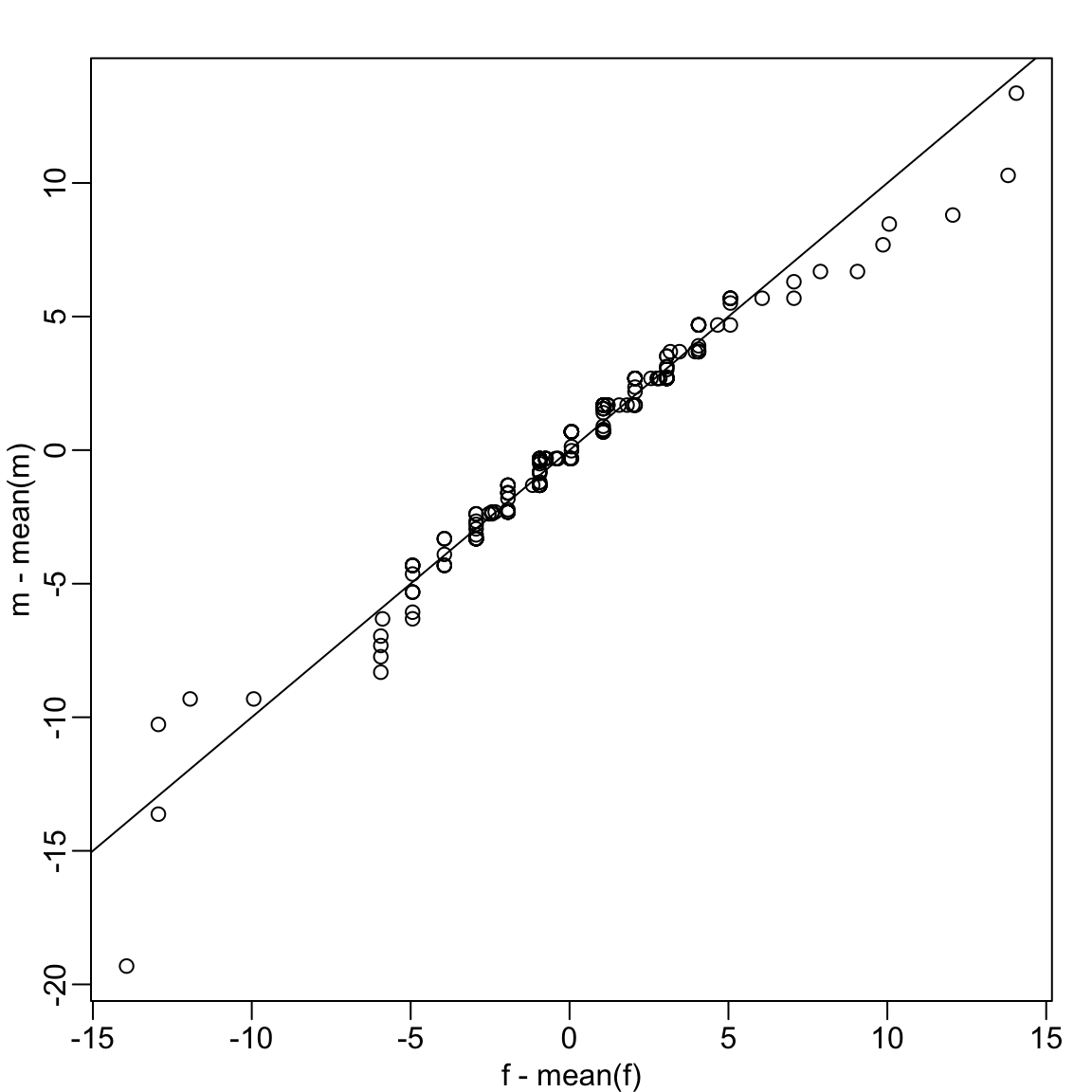
Up to now we have only examined the distribution of heights for males. We expect that the distribution for females to be similar except for 2-3 inch shift due to males being taller than females, on average. A qqplot confirms this after shifting both distributions to have the same average height:
We see that in the middle of the plot the points are on the identity line, confirming the distributions are similar except for the shift. However, for the smaller and larger quantiles we see a deviation from the line. We come back to this observation in Section 3.3.
Percentiles
Percentiles are special cases of quantiles where the probability \(p\) is expressed as a percentage. For example, we refer to the case of \(p = 0.25\) as the 25th percentile, representing a value below which 25% of the data falls. The most famous percentile is the 50th, also known as the median.
Another special case is the quartiles, defined as the quantiles at \(p = 0.25,0.50\), and \(0.75\). Quartiles divide the data into four regions, each containing 25% of the observations. Quartiles are visualized by boxplots as seen in Section 2.5.
3.2 Assessing normality with QQ plots
A common use of qqplots is to assess whether data follow a normal distribution.
The cumulative distribution function (CDF) of the standard normal is written as \(\Phi(x)\), giving the probability that a standard normal random variable is less than \(x\). For example, \(\Phi(-1.96) = 0.025\) and \(\Phi(1.96) = 0.975\). In R, this is computed with pnorm:
pnorm(-1.96)
#> [1] 0.025
The inverse of \(\Phi\), denoted \(\Phi^{-1}(p)\), provides the theoretical quantiles. For instance, \(\Phi^{-1}(0.975) = 1.96\) which we compute with qnorm:
qnorm(0.975)
#> [1] 1.96
By default, pnorm and qnorm assume the standard normal distribution (mean 0, SD 1). You can specify different parameters with the mean and sd arguments:
qnorm(0.975, mean = 69, sd = 3)
#> [1] 74.9
For observed data, we can compute sample quantiles using the quantile function. For example, here are the quartiles of male heights:
To check whether these data are approximately normal, we can construct a QQ plot following these steps:
- Define a vector of proportions \(p_1, \dots, p_m\).
- Compute sample quantiles from the data.
- Compute theoretical quantiles from a normal distribution with the same mean and SD as the data.
- Plot the two sets of quantiles against each other.
Example:
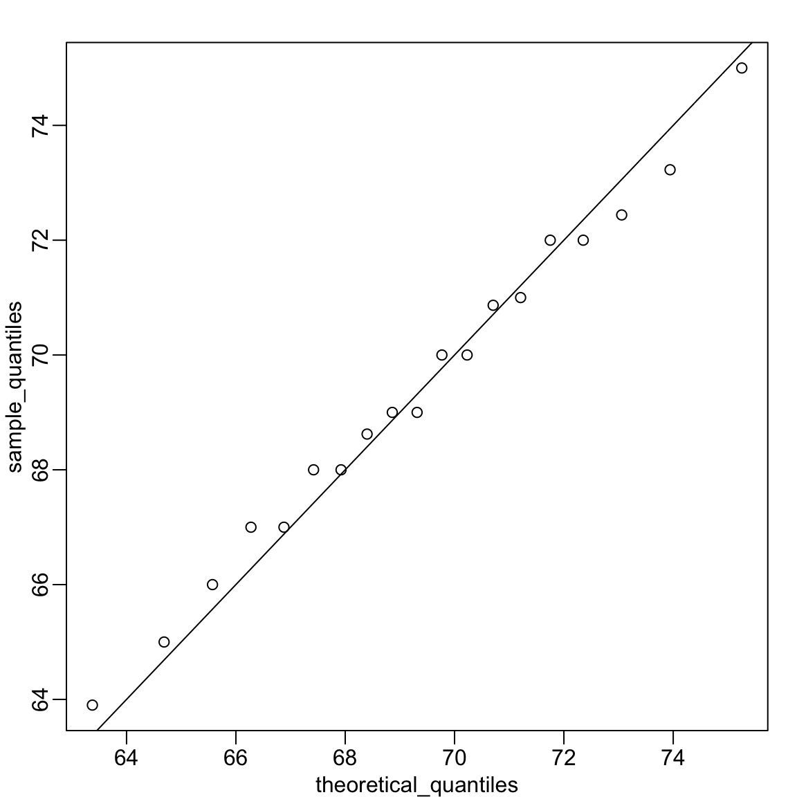
Recall that the qqplot in Section 3.1 compared quantiles from two sets of observations, where points along the identity line indicated similar distributions. In this case, the theoretical quantiles along the x-axis are computed using the sample mean and standard deviation. Here, the identity line marks where we expect points to lie if the data really came from this theoretical distribution.
Because the points fall close to the identity line, we conclude that the normal distribution provides a good approximation for this dataset.
The code becomes simpler if we standardize the data first:
And similarly with ggplot2, which uses a different vector of probabilities than our p:
R provides built-in functions for generating qqplots that compare observed data to a normal distribution:
The function qqnorm() plots the sample quantiles of the data x against theoretical quantiles from a standard normal distribution. The function qqline() adds a reference line representing where we would expect points to lie if the data were normally distributed with the same mean and standard deviation as the observed sample. Because the sample and theoretical quantiles are not on the same scale, this reference is no longer the identity line.
By default, both qqnorm and geom_qq use all \(n\) quantiles, with \(p_i = (i - 0.5)/n\). Because of this default behavior, large datasets can produce thousands of overlapping points that appear as a solid line. In such cases, it’s better to compute and plot a smaller, representative set of quantiles manually rather than relying on the defaults in qqplot or geom_qq.
3.3 Stratification
In data analysis, we often divide observations into groups based on the values of one or more variables associated with those observations. For example, we can divide the height values into groups based on a sex variable: females and males. We call this procedure stratification and refer to the resulting groups as strata.
Stratification is common in data visualization because we are often interested in how the distribution of variables differs across different subgroups.
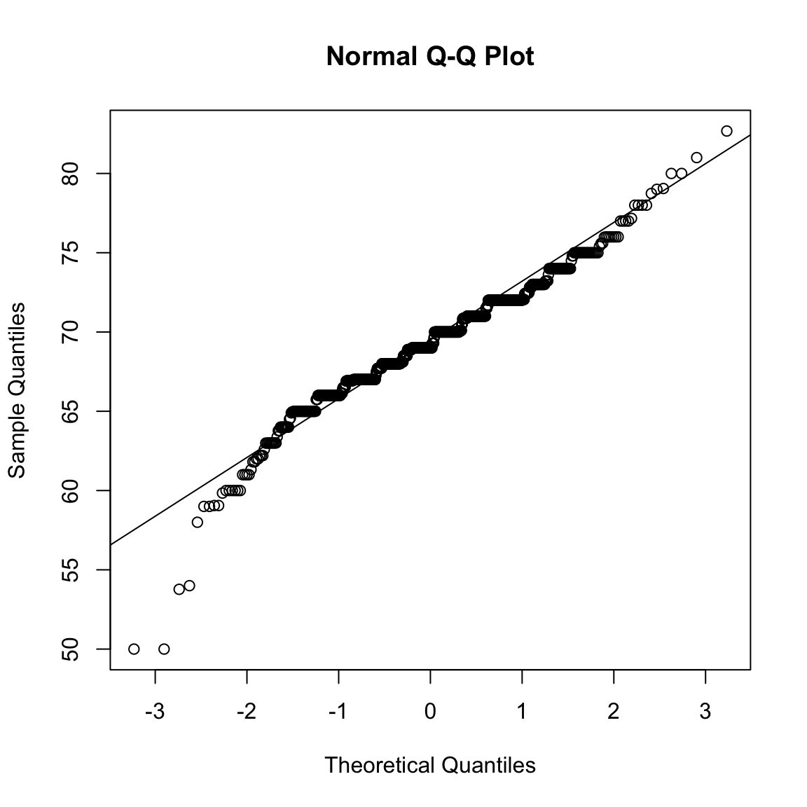
Using the histogram, density plots, and qqplots, we have become convinced that the male height data is well approximated with a normal distribution. In this case, we report back to ET a very succinct summary: male heights follow a normal distribution with an average of 69.3 inches and a SD of 3.6 inches. With this information, ET will have a good idea of what to expect when he meets our male students. However, to provide a complete picture we need to also provide a summary of the female heights.
Boxplots are useful when we want to quickly compare two or more distributions. Here are the heights for females and males:
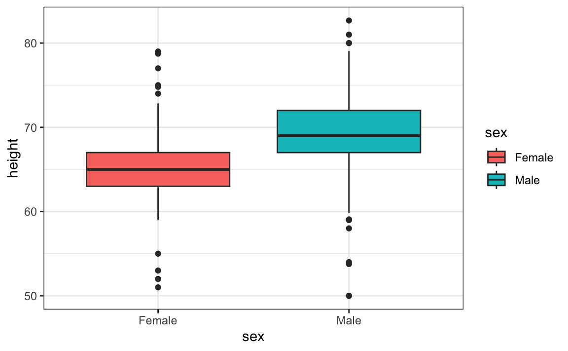
The plot immediately reveals that males are, on average, taller than females. The standard deviations appear to be similar. But does the normal approximation also work for the female height data collected by the survey? We expect that they will follow a normal distribution, just like males. However, exploratory plots reveal that the approximation is not as useful:
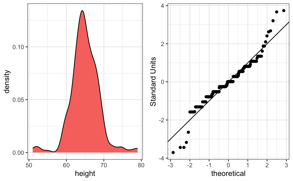
We see something we did not see for the males: the density plot has a second bump near a height of 52 inches. This is reflected in the qqplot with five points that suggest shorter than expected heights for a normal distribution. The qqplot also shows that the highest points tend to be taller than expected by the normal distribution. When reporting back to ET, we might need to provide a histogram rather than just the average and standard deviation for the female heights.
This is unexpected—studies of other female height distributions find they are well approximated by a normal distribution. What explains the five unusually short heights and the excess of very tall students? One possibility is that some males entered their heights without changing the default sex selection of Female in the form. Whatever the cause, data visualization has uncovered a potential flaw in the data.
Regarding the five smallest values, note that these are:
Because these are reported heights, a possibility is that the student meant to enter 5'1", 5'2", 5'3" or 5'5".
3.4 Exercises
1. Study the following boxplots showing population sizes by country:
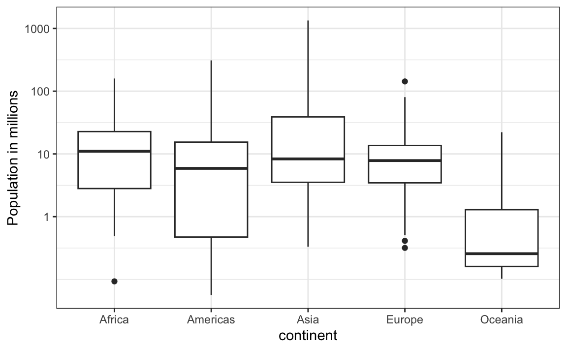
Which continent has the country with the biggest population size?
2. Which continent has the largest median population size?
3. What is median population size for Africa to the nearest million?
4. What proportion of countries in Europe have populations below 14 million?
- 0.99
- 0.75
- 0.50
- 0.25
5. On the displayed log scale, which continent has the largest interquartile range (IQR)? Hint: IQR was defined in Section 2.5.
6. Define variables containing the heights of males and females as follows:
library(dslabs)
male <- heights$height[heights$sex == "Male"]
female <- heights$height[heights$sex == "Female"]
How many measurements do we have for each?
7. Suppose we can’t make a plot and want to compare the distributions side by side. We can’t just list all the numbers. Instead, we will look at the percentiles. Create a table for each sex with 10th, 30th, 50th, 70th, & 90th percentiles. Then create a data frame with a column for each sex, and 5 rows as these percentiles.
8. Use a qqplot to demonstrate that murder rates do not follow a normal distribution.
9. Remove the data for the District of Columbia (DC), then strarify the data into the four regions and generate a qqplot for each to see if the murder rates follow a normal distribution within each of the four regions.
10. Calculate the mean and standard deviation of murder rates for each region. Perform the analysis twice: once including all observations and once excluding Washington, DC. Discuss which comparison is more informative and explain your reasoning.