28 Conditional Expectations and Smoothing
In machine learning applications, we can rarely predict outcomes perfectly. Spam filters miss obvious junk mail, Siri mishears words, and sometimes your bank incorrectly flags a legitimate purchase as fraud. The main reason these mistakes occur is that perfect prediction is often impossible. In most real datasets, we find groups of observations that share identical predictor values but have different outcomes. Because a prediction rule is a function, identical inputs must produce identical outputs. So whenever the same predictor values occur with different outcomes, as in the previous chapter, where both males and females can be exactly the same height, no algorithm can be correct for all such cases.
But this does not mean we can’t build useful algorithms, ones far better than guessing and often better than human experts. To do this optimally, we use the probabilistic framework introduced in Section 15.3. Even if individual outcomes differ, we assume that observations with the same predictor values share the same underlying probability of belonging to each class. For categorical outcomes, this leads naturally to modeling quantities such as
\[ \Pr(Y=1 \mid X=x), \]
which summarizes the best possible predictions we can hope to make.
This brings us to the concept of smoothing. In practice, these conditional probabilities are unknown and must be estimated from noisy data. Smoothing, also known as curve fitting or low-pass filtering, is a general technique for uncovering underlying trends when the exact shape of the trend is not known. The idea is that while the true relationship between predictors and outcomes varies smoothly, the data themselves include random fluctuations. Smoothing methods exploit this smoothness to estimate the underlying pattern, providing stable and interpretable approximations to quantities like \(\Pr(Y=1 \mid X=x)\) that we rely on for machine learning algorithms. In fact, many of the most widely used machine learning algorithms can be viewed, either directly or indirectly, as smoothing procedures, which is why smoothing is a foundational concept in this field.
28.1 Conditional probabilities and expectations
We use the notation \((X_1 = x_1,\dots,X_p=x_p)\) to represent the fact that we have observed values \(x_1,\dots,x_p\) for covariates \(X_1, \dots, X_p\). This does not imply that the outcome \(Y\) will take a specific value. Instead, it implies a specific probability. In particular, we denote the conditional probabilities for each class \(k\) with:
\[ \mathrm{Pr}(Y=k \mid X_1 = x_1,\dots,X_p=x_p), \, \mbox{for}\,k=1,\dots,K. \]
To avoid writing out all the predictors, we will use bold letters like this: \(\mathbf{X} \equiv (X_1,\dots,X_p)^\top\) and \(\mathbf{x} \equiv (x_1,\dots,x_p)^\top\). We will also use the following notation for the conditional probability of being class \(k\):
\[ p_k(\mathbf{x}) = \mathrm{Pr}(Y=k \mid \mathbf{X}=\mathbf{x}), \, \mbox{for}\, k=1,\dots,K. \] Notice that the \(p_k(\mathbf{x})\) have to add up to 1 for each \(\mathbf{x}\), so once we know \(K-1\), we know all \(K\).
When the outcome is binary, we only need to know 1, so we drop the \(k\) and use the notation \(p(\mathbf{x}) = \mathrm{Pr}(Y=1 \mid \mathbf{X}=\mathbf{x})\).
Do not be confused by the fact that we use the letter \(p\) for two different things: the conditional probability \(p(\mathbf{x})\) and the number of predictors \(p\).
These probabilities guide the construction of an algorithm that makes the best prediction: for any given \(\mathbf{x}\), we will predict the class \(k\) with the largest probability among \(p_1(\mathbf{x}), p_2(\mathbf{x}), \dots p_K(\mathbf{x})\). In mathematical notation, we write it like this:
\[\hat{y}(\mathbf{x}) = \max_k p_k(\mathbf{x})\]
In machine learning, we refer to this as Bayes’ Rule. But this is a theoretical rule since, in practice, we don’t know \(p_k(\mathbf{x}), k=1,\dots,K\). In fact, estimating these conditional probabilities can be thought of as the main challenge of machine learning. The better our probability estimates \(\hat{p}_k(\mathbf{x})\), the better our predictor.
So how well we predict depends on two things: 1) how close are the \(\max_k p_k(\mathbf{x})\) to 1 or 0 (perfect certainty) and 2) how close our estimates \(\hat{p}_k(\mathbf{x})\) are to \(p_k(\mathbf{x})\). We can’t do anything about the first restriction, as it is determined by the nature of the problem, so our energy goes into finding ways to best estimate conditional probabilities.
The first restriction does imply that we have limits as to how well even the best possible algorithm can perform. You should get used to the idea that while in some challenges we will be able to achieve almost perfect accuracy—with digit readers, for example—in others, our success is restricted by the randomness of the process, such as medical diagnosis from biometric data.
Keep in mind that defining our prediction by maximizing the probability is not always optimal in practice and depends on the context. As discussed in Chapter 27, sensitivity and specificity may differ in importance. But even in these cases, having a good estimate of the \(p_k(x), k=1,\dots,K\) will suffice for us to build optimal prediction models, since we can control the balance between specificity and sensitivity however we wish. For instance, we can simply change the cutoffs used to predict one outcome or the other. In the plane example, we may ground the plane anytime the probability of malfunction is lower than 1 in a million, as opposed to the default 1/2 used when error types are equally undesired.
For binary data, you can think of the probability \(\mathrm{Pr}(Y=1 \mid \mathbf{X}=\mathbf{x})\) as the proportion of 1s in the stratum of the population for which \(\mathbf{X}=\mathbf{x}\). Many of the algorithms we will learn can be applied to both categorical and continuous data due to the connection between conditional probabilities and conditional expectations.
Because the expectation is the average of values \(y_1,\dots,y_n\) in the population, in the case in which the \(y\)s are 0 or 1, the expectation is equivalent to the probability of randomly picking a one since the average is simply the proportion of ones:
\[ \mathrm{E}[Y \mid \mathbf{X}=\mathbf{x}]=\mathrm{Pr}(Y=1 \mid \mathbf{X}=\mathbf{x}). \]
This implies that the conditional probability is a conditional expectation. As a result, we often only use the expectation to denote both the conditional probability and the conditional expectation.
Just like with categorical outcomes, in most applications, the same observed predictors do not guarantee the same continuous outcomes. Instead, we assume that the outcome follows the same conditional distribution. We will now explain why we use the conditional expectation to define our predictors.
28.2 Conditional expectations minimize the squared loss function
The expected value has an attractive mathematical property: it minimizes the MSE. Specifically, of all possible predictions \(\hat{Y}\),
\[ \hat{Y} = \mathrm{E}[Y \mid \mathbf{X}=\mathbf{x}] \, \mbox{ minimizes } \, \mathrm{E}[ (\hat{Y} - Y)^2 \mid \mathbf{X}=\mathbf{x}] \]
Due to this property, a succinct description of the main task of machine learning is that we use data to estimate:
\[ f(\mathbf{x}) \equiv \mathrm{E}[Y \mid \mathbf{X}=\mathbf{x} ] \]
for any set of features \(\mathbf{x} = (x_1, \dots, x_p)^\top\).
This is easier said than done, since this function can take any shape and \(p\) can be very large. Consider a case in which we only have one predictor \(x\). The expectation \(\mathrm{E}[Y \mid X=x]\) can be any function of \(x\): a line, a parabola, a sine wave, a step function, anything. It gets even more complicated when we consider instances with large \(p\), in which case \(f(\mathbf{x})\) is a function of a multidimensional vector \(\mathbf{x}\). For example, in our digits data, \(p = 784\)!
The main way in which competing machine learning algorithms differ is in their approach to estimating this conditional expectation. Because we must estimate such a flexible and potentially high-dimensional function from noisy, finite data, we need strategies that extract the underlying signal without being overwhelmed by randomness. A common and powerful idea is to assume that although the data themselves may look scattered, the true function \(f(\mathbf{x})\) varies smoothly as \(\mathbf{x}\) changes. This assumption allows us to borrow strength from nearby points and produce stable estimates even when exact predictor values are rarely repeated. This brings us to the concept of smoothing, one of the most fundamental tools in machine learning, underpinning many of the algorithms we will study next.
28.3 Smoothing
Smoothing is a core idea in machine learning and statistical modeling: when data are noisy, we often assume that the underlying trend changes gradually rather than jumping erratically from point to point. The goal of smoothing is to recover this hidden structure from the data.
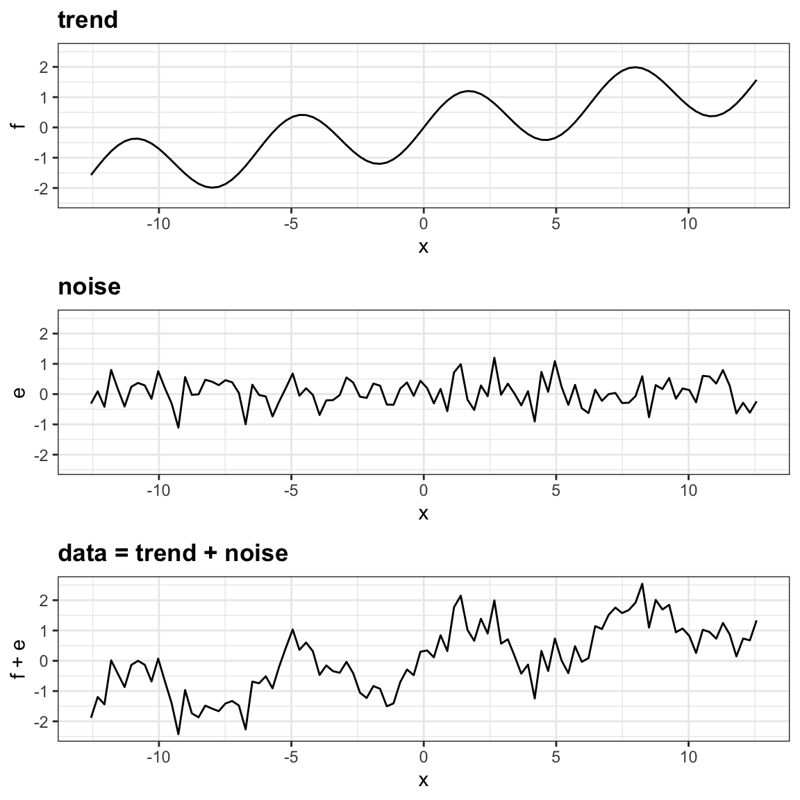
To motivate the idea, consider the plot below: the noise obscures the trend, but it does not destroy it. Our task is to uncover the trend from the noisy data.
In the next sections, we explore how smoothing techniques accomplish this, starting with a simple case study that illustrates the challenges and the intuition behind the methods.
Example: Is it a 2 or a 7?
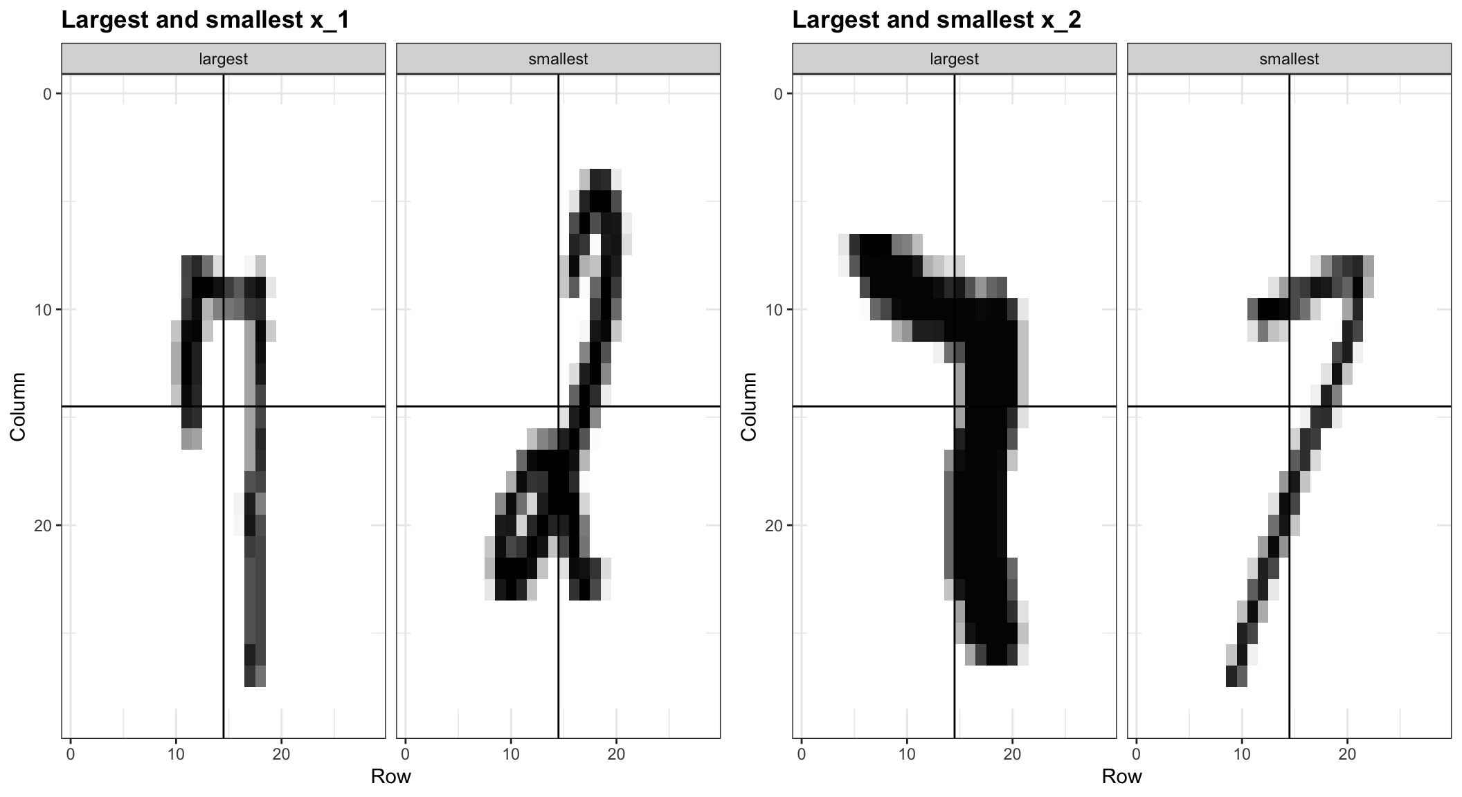
To motivate the need for smoothing and make the connection with machine learning, we will construct a simplified version of the MNIST dataset with just two classes for the outcome and two predictors. Specifically, we define the challenge as building an algorithm that can determine if a digit is a 2 or a 7 from the proportion of an image’s dark pixels that fall in the upper left quadrant (\(X_1\)) and the lower right quadrant (\(X_2\)). We also selected a random sample of 1,000 digits divided into training and test sets. Both sets are almost evenly distributed with 2s and 7s.
To illustrate how to interpret \(X_1\) and \(X_2\), we include four example images. On the left are the original images of the two digits with the largest and smallest values for \(X_1\), and on the right, we have the images corresponding to the largest and smallest values of \(X_2\):
The dslabs package includes this example in the object mnist_27. In the training set, we have 800 observations, and in the test set, we have 200. Each observation has:
- an outcome \(y_i\), indicating whether the digit is a 2 or a 7, and
- a feature vector \(\mathbf{x}_i = (x_{i1}, x_{i2})^\top\), a point in two-dimensional space extracted from the image.
So the datasets consist of pairs \((\mathbf{x}_i, y_i)\), where each \(\mathbf{x}_i\) is a 2D feature, and each \(y_i\) is the corresponding digit label.
Here is a plot of the observed \(X_2\) versus observed \(X_1\) with color determining if \(y\) is 2 (red) or 7 (blue):
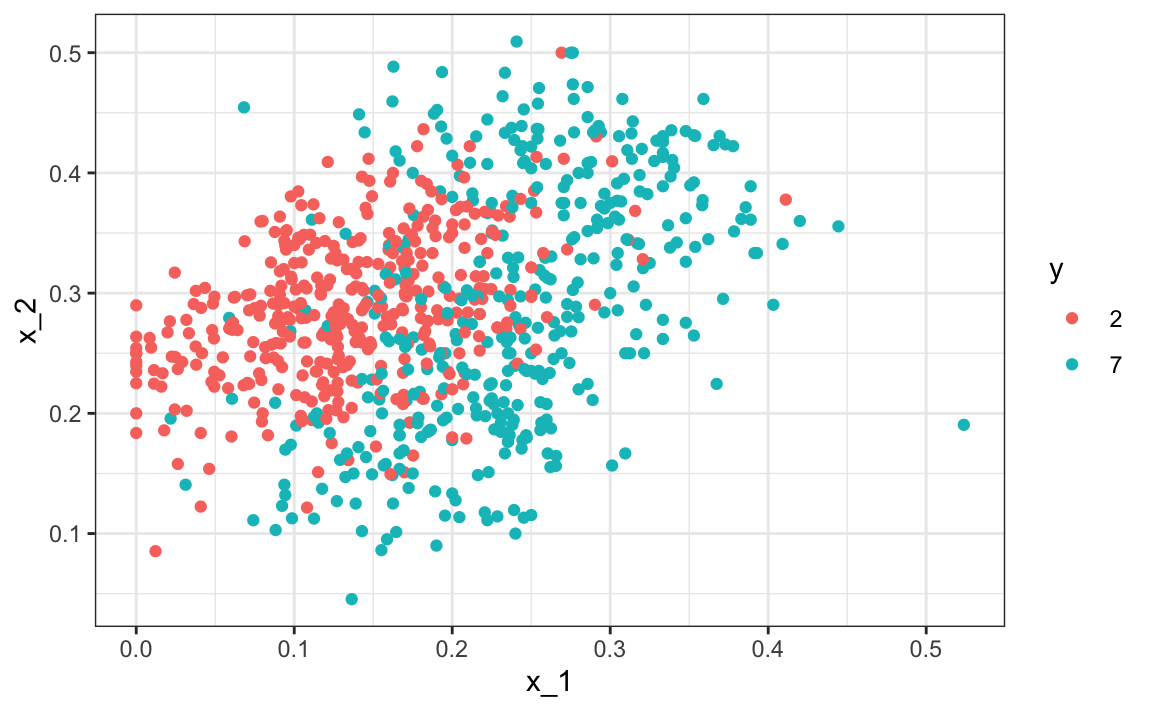
We can immediately see some patterns. For example, if \(x_1\) is large (there was a lot of ink in the upper-left part of the image), then the digit is probably a 7. Also, for smaller values of \(x_1\), the 2s appear to be in the mid-range values of \(x_2\).
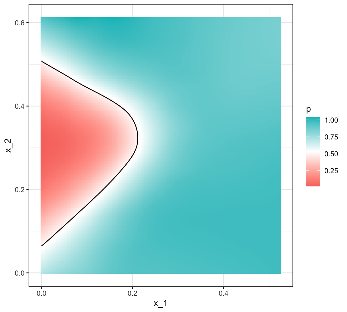
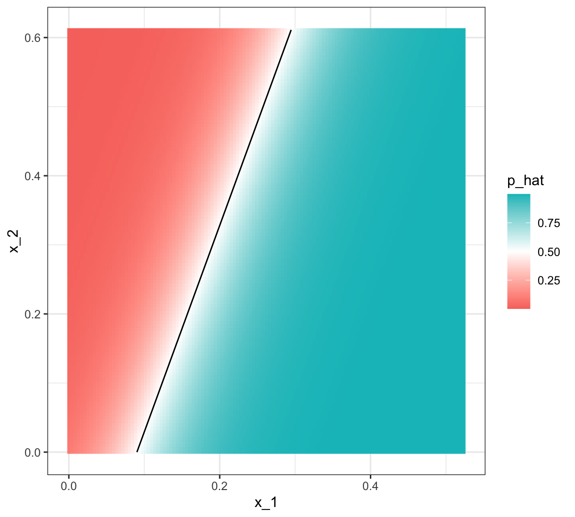
Because we constructed the mnist_27 example as a subset of the MNIST dataset, we can use the full dataset to build the true conditional distribution \(p(\mathbf{x})\), treating the 60,000 MNIST digits as the full population. Keep in mind that in practice, we don’t have access to the true conditional distribution. We include it in this educational example because it permits the comparison of \(\hat{p}(\mathbf{x})\) to the true \(p(\mathbf{x})\). This comparison teaches us the limitations of different algorithms.
We have stored the true \(p(\mathbf{x})\) in the mnist_27 and can plot it as an image. We draw a curve that separates values of \(\mathbf{x}\) for which \(p(\mathbf{x}) > 0.5\) and those for which \(p(\mathbf{x}) < 0.5\):
We can start getting a sense for why these predictors are useful, but also why the problem will be somewhat challenging.
We haven’t introduced many classification methods yet, so let’s start with a simple one based on a GLM:
\[ \log\frac{p(\mathbf{x})}{1-p(\mathbf{x})} = \beta_0 + \beta_1 x_1 + \beta_2 x_2 \]
We can fit this model to obtain an estimate \(\hat{p}(\mathbf{x})\) by using the glm function. We define a decision rule by predicting \(\hat{y}(\mathbf{x})=1\) if \(\hat{p}(\mathbf{x})>0.5\) and 0 otherwise.
If we do this, we get an accuracy of 0.775, well above 50%. Not bad for our first try. But can we do better?
To start understanding the limitations of regression, first note that, because \(p(\mathbf{x}) = 0.5 \iff \log p(\mathbf{x})/(1-p(\mathbf{x})) = 0\), with GLM \(\hat{p}(\mathbf{x})\), the boundary defined by \(p(\mathbf{x}) = 0.5\) must satisfy:
\[ \hat{\beta}_0 + \hat{\beta}_1 x_1 + \hat{\beta}_2 x_2 = 0 \implies x_2 = -\hat{\beta}_0/\hat{\beta}_2 -\hat{\beta}_1/\hat{\beta}_2 x_1 \]
which implies that the decision boundary is linear: \(x_2\) must be a linear function of \(x_1\), and more generally, the set of points \(\mathbf{x}\) satisfying \(\hat{p}(\mathbf{x}) = 0.5\) forms a hyperplane in the predictor space.
This suggests that our GLM approach has no chance of capturing the non-linear nature of the true \(p(\mathbf{x})\). Below is a visual representation of \(\hat{p}(\mathbf{x})\), which clearly shows how it fails to capture the shape of \(p(\mathbf{x})\):
We need something more flexible: a method that permits estimates with shapes other than a plane. Smoothing techniques permit this flexibility. We will start by describing nearest neighbor and kernel approaches. To understand why we cover this topic, remember that the concepts behind smoothing techniques are extremely useful in machine learning because conditional expectations/probabilities can be thought of as trends of unknown shapes that we need to estimate in the presence of uncertainty.
28.4 Local Smoothing Methods
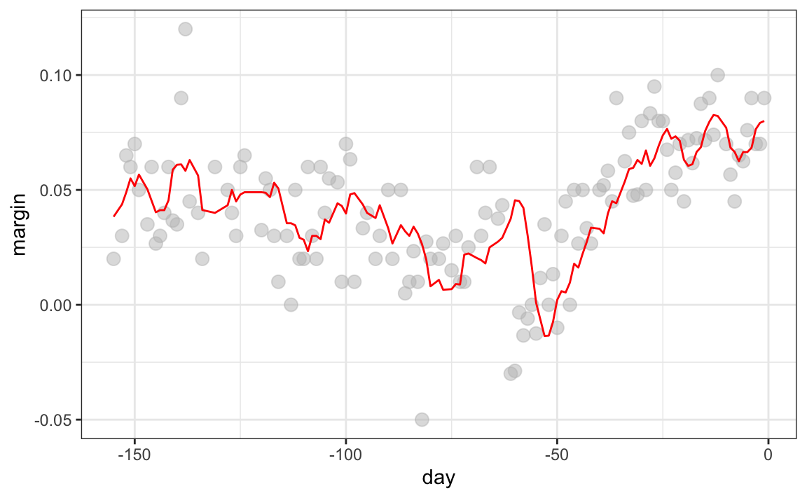
To explain the main ideas behind smoothing concepts, we will focus first on a problem with just one predictor. We pick an example with a clear trend that is not linear:the 2008 US popular vote poll margin between Barack Obama and John McCain.
polls_2008 |> ggplot(aes(day, margin)) + geom_point()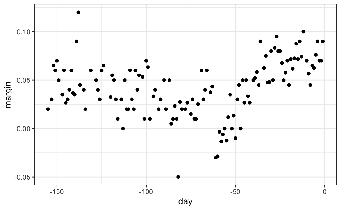
Later, we will learn how to extend smoothing ideas to higher dimensions.
For the purposes of the popular vote example, do not think of it as a forecasting problem. Instead, we are simply interested in learning the shape of the trend once we have all the data.
We assume that for any given day \(x\), there is a true preference among the electorate \(f(x)\), but due to the uncertainty introduced by the polling, each data point comes with an error \(\varepsilon\). A mathematical model for the observed poll margin is:
\[ Y_i = f(x_i) + \varepsilon_i \]
To think of this as a machine learning problem, consider that we want to predict \(Y\) given a day \(x\). We are interested in finding the true trend \(f(x) = \mathrm{E}[Y \mid X=x]\), but since we don’t know this conditional expectation, we have to estimate it.
Let’s start by using linear regression since we haven’t learn any alternatives. Below is the estimate we obtain:
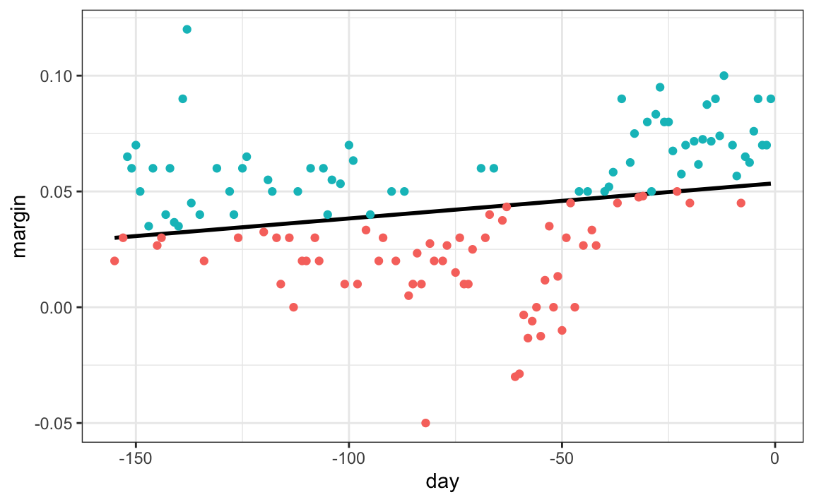
The fitted regression line does not appear to describe the trend very well. For example, on September 4 (day -62), the Republican Convention was held, and the data suggest that it gave John McCain a boost in the polls. However, the regression line does not capture this potential trend. To see the lack of fit more clearly, we note that points above the fitted line (blue) and those below (red) are not evenly distributed across days. We therefore need an alternative, more flexible approach.
Next, we describe smoothing techniques that can overcome this limitation.
Bin smoothing
The general idea of bin smoothing is to group data points into strata in which the value of \(f(x)\) can be assumed to be constant. We can make this assumption when we think \(f(x)\) changes slowly and, as a result, \(f(x)\) is almost constant in small windows of \(x\).
For the poll_2008 data, the smoothness assumption means believing that public opinion does not shift dramatically from one day to the next. For example, we might assume that support remains roughly constant over the span of a week. With this assumption in place, several consecutive days share approximately the same expected value, giving us multiple observations that help us estimate the underlying trend at that point.
If we fix a day to be in the center of our week, call it \(x_0\), then for any other day \(x\) such that \(|x - x_0| \leq h\), with \(h = 3.5\), we assume \(f(x)\) is a constant \(f(x) = \mu\). This assumption implies that:
\[ E[Y_i | X_i = x_i ] \approx \mu \mbox{ if } |x_i - x_0| \leq 3.5 \]
In smoothing, we refer to \(h\) as the bandwidth. The interval of points satisfying \(|x_i - x_0| \le h\) is called the window size or span.
The terms bandwidth, kernel radius, window size, and span are sometimes used interchangeably, but their precise meaning depends on the convention. With the definition above, the window size is twice the bandwidth.
Some R functions, such as ksmooth(), use the full window size as the bandwidth. Under that convention, a bandwidth of 7 corresponds to \(h = 3.5\) in our notation.
This assumption implies that a good estimate for \(f(x_0)\) is the average of the \(y_i\) values in the window. If we define \(A_0\) as the set of indexes \(i\) such that \(|x_i - x_0| \leq 3.5\) and \(N_0\) as the number of indexes in \(A_0\), then our estimate is:
\[ \hat{f}(x_0) = \frac{1}{N_0} \sum_{i \in A_0} y_i \]
We make this calculation with each value of \(x\) as the center.
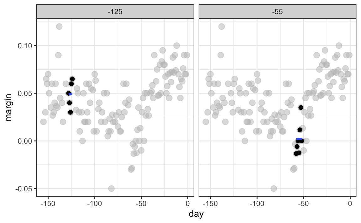
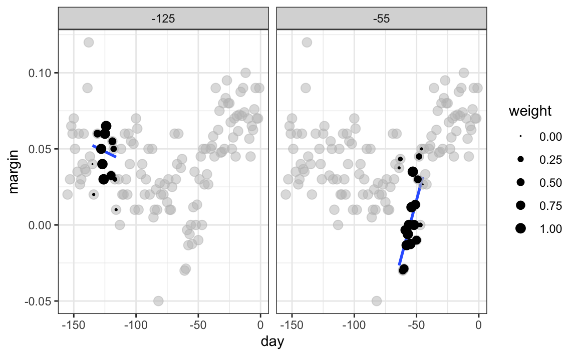
In the poll example, for each day, we would compute the average of the values within a week with that day in the center. Here are two examples: \(x_0 = -125\) and \(x_0 = -55\). The blue segment represents the resulting average.
By computing this mean for every point, we form an estimate of the underlying curve \(f(x)\). Below, we show the procedure happening as we move from -155 up to 0. At each value of \(x_0\), we keep the estimate \(\hat{f}(x_0)\) and move on to the next point:

The final code look like this:
and the resulting plot is:
Kernel smoothers
The bin smoother’s estimate can look quite wiggly. One reason is that as the window slides, points abruptly enter or leave the bin, causing jumps in the average. We can reduce these discontinuities with a kernel smoother. A kernel smoother assigns a weight to each data point according to its distance from the target location \(x_0\), then forms a weighted average.
Formally, let \(K\) be a nonnegative kernel function and let \(h>0\) be a bandwidth. Define weights
\[ w_{x_0}(x_i) = K\!\left(\frac{x_i - x_0}{h}\right), \]
and estimate the trend at \(x_0\) with
\[ \hat{f}(x_0) \;=\; \frac{\sum_{i=1}^N w_{x_0}(x_i)\,y_i}{\sum_{i=1}^N w_{x_0}(x_i)}. \]
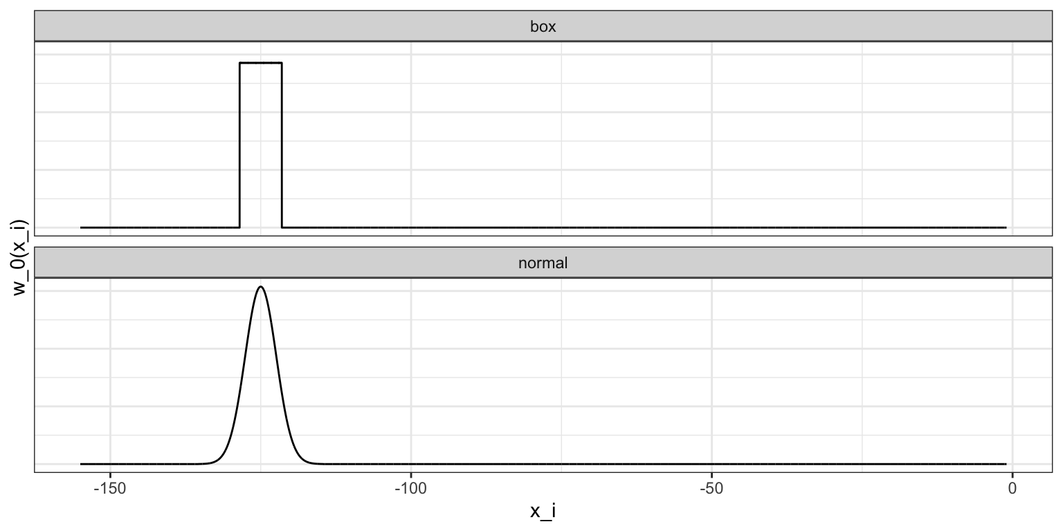
The bin smoother is a special case with the boxcar (or uniform) kernel \(K(u) = 1\) if \(|u| \leq 1\) and 0 otherwise, which corresponds to assigning weight 1 inside the window and 0 outside. This is why, in the code above, we used kernel = "box" with ksmooth. To attenuate the wiggles caused by abrupt point entry and exit, we can use a smooth kernel that gives more weight to points near \(x_0\) and rapidly decays for distant points. The option kernel = "normal" in ksmooth does exactly this by using the standard normal density for \(K\).
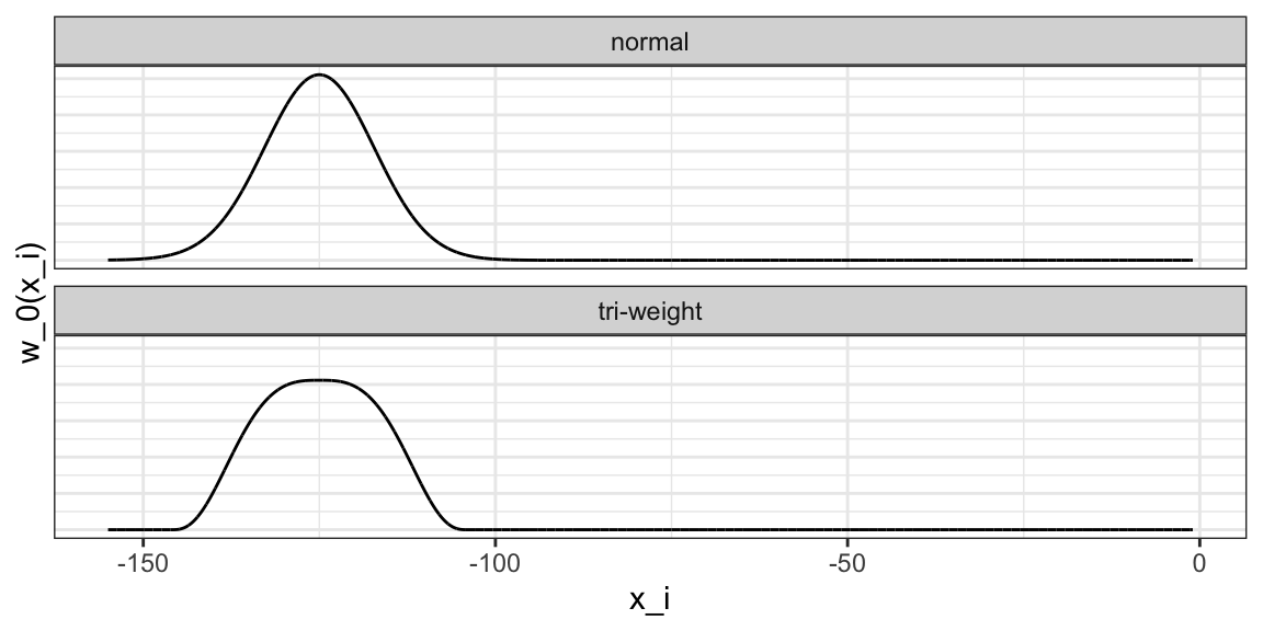
Below we visualize the box and normal kernels for \(x_0 = -125\) and \(h = 3.5\), showing how the boxcar kernel weighs all in-bin points equally, while the normal kernel downweights points near the edges.
The final code looks like this:
and the resulting plot is:

Notice that this version looks smoother.
There are several functions in R that implement bin smoothers. One example is ksmooth, shown above. In practice, however, we typically prefer methods that use slightly more complex models than fitting a constant. The final result above, for example, is still somewhat wiggly in parts we don’t expect it to be (between -125 and -75, for example). Methods such as loess, which we explain next, improve on this.
Local weighted regression (loess)
A limitation of the bin smoother approach just described is that we need small windows for the approximately constant assumptions to hold. As a result, we end up with a small number of data points to average and obtain imprecise estimates \(\hat{f}(x)\). Here, we describe how local weighted regression (loess) permits us to consider larger window sizes. To do this, we will use a mathematical result, referred to as Taylor’s theorem, which tells us that if you look closely enough at any smooth function \(f(x)\), it will look like a line. To see why this makes sense, consider the curved edges gardeners make using straight-edged spades:

(“Downing Street garden path edge”1 by Flickr user Number 102. CC-BY 2.0 license3.)
Instead of assuming the function is approximately constant in a window, we assume the function is locally linear. We can consider larger window sizes with the linear assumption than with a constant. Instead of the one-week window, we consider a larger one in which the trend is approximately linear. We start with a three-week window (\(h = 10.5\)) and later consider and evaluate other options:
\[ E[Y_i | X_i = x_i ] = \beta_0 + \beta_1 (x_i-x_0) \mbox{ if } |x_i - x_0| \leq 10.5 \]
For every point \(x_0\), loess defines a window and fits a line within that window. Here is an example showing the fits for \(x_0=-125\) and \(x_0 = -55\):
The fitted value at \(x_0\) becomes our estimate \(\hat{f}(x_0)\). Below, we show the procedure happening as we move from -155 up to 0:

We can write this code to apply loess to the entire dataset::
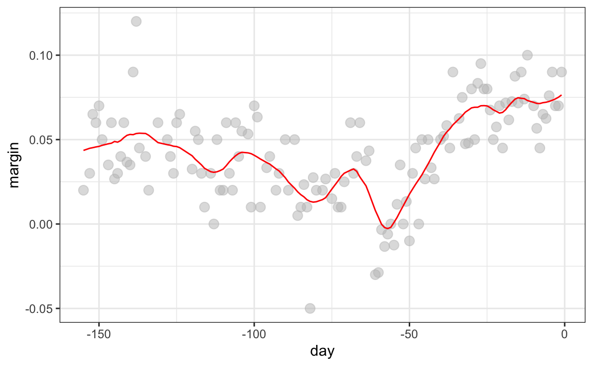
The final result is a smoother fit than the bin smoother since we use larger sample sizes to estimate our local parameters:
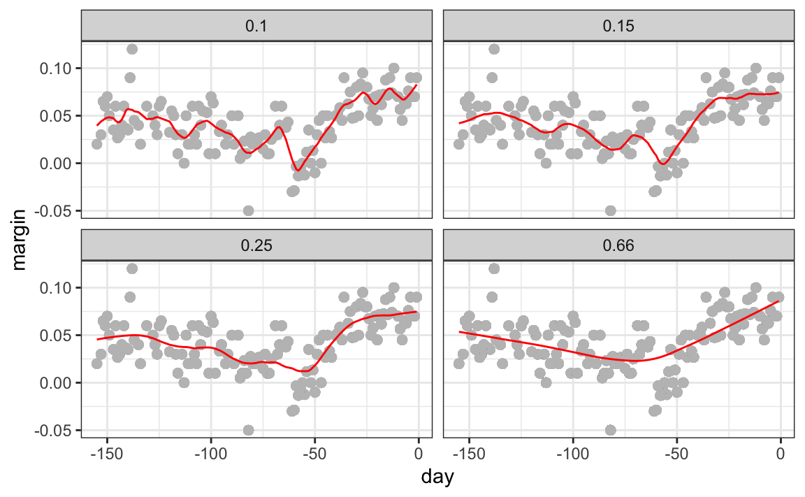
Different spans give us different estimates. We can see how different window sizes lead to different estimates:

Here are the final estimates:
There are four other differences between loess and the typical bin smoother.
1. Rather than keeping the bin size the same, loess keeps the number of points used in the local fit the same. This number is controlled via the span argument, which expects a proportion. For example, if N is the number of data points and span=0.5, then for a given \(x\), loess will use the 0.5*N closest points to \(x\) for the fit.
2. When fitting a line locally, loess uses a weighted approach. Basically, instead of minimizing the residual sum of squares, we minimize a weighted version:
\[ \sum_{i=1}^N w_0(x_i) \left[y_i - \left\{\beta_0 + \beta_1 (x_i-x_0)\right\}\right]^2 \]
3. Instead of the Gaussian kernel, loess uses a function called the Tukey tri-weight:
\[ K(u)= \left( 1 - |u|^3\right)^3 \mbox{ if } |u| \leq 1 \mbox{ and } K(u) = 0 \mbox{ if } |u| > 1 \]
To define the weights, we denote \(2h\) as the window size and define \(w_0(x_i)\) as above: \(w_0(x_i) = K\left(\frac{x_i - x_0}{h}\right)\).
This kernel differs from the Gaussian kernel in that more points get values closer to the max and that points outside the window get zero weight:
4. loess has the option of fitting the local model robustly. An iterative algorithm is implemented in which, after fitting a model in one iteration, outliers are detected and down-weighted for the next iteration. To use this option, we use the argument family="symmetric".
loess can also fit local parabolas instead of lines. Taylor’s theorem also tells us that if you look at any mathematical function closely enough, it looks like a parabola. The theorem also states that you don’t have to look as closely when approximating with parabolas as you do when approximating with lines. This means we can make our windows even larger and fit parabolas instead of lines.
\[ E[Y_i | X_i = x_i ] = \beta_0 + \beta_1 (x_i-x_0) + \beta_2 (x_i-x_0)^2 \mbox{ if } |x_i - x_0| \leq h \]
You may have noticed that when we showed the code for using loess, we set degree = 1. This tells loess to fit polynomials of degree 1, a fancy name for lines. If you read the help page for loess, you will see that the argument degree defaults to 2. By default, loess fits parabolas, not lines. Here is a comparison of the fitting lines (red dashed) and fitting parabolas (orange solid):
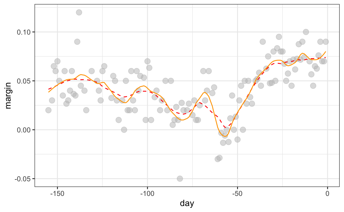
The degree = 2 gives us more wiggly results. In general, we actually prefer degree = 1 as it is less prone to this kind of noise.
Beware of default smoothing parameters
The geom_smooth function in the ggplot2 package supports a variety of smoothing methods. By default, it uses loess or a related method called Generalized Additive Model, the latter if any window of data exceeds 1000 observations. We can request that loess be used with the method parameter:
polls_2008 |> ggplot(aes(day, margin)) + geom_point() +
  geom_smooth(method = loess, formula = y ~ x)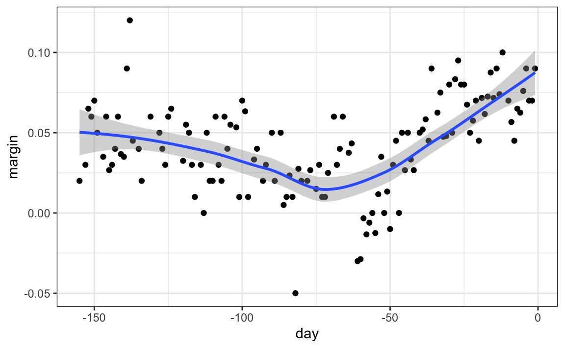
But be careful with default parameters, as they are rarely optimal. However, you can conveniently change them. For example, with loess, you can use the following code:
polls_2008 |> ggplot(aes(day, margin)) + geom_point() +
  geom_smooth(method = loess, formula = y ~ x,
    method.args = list(span = 0.15, degree = 1))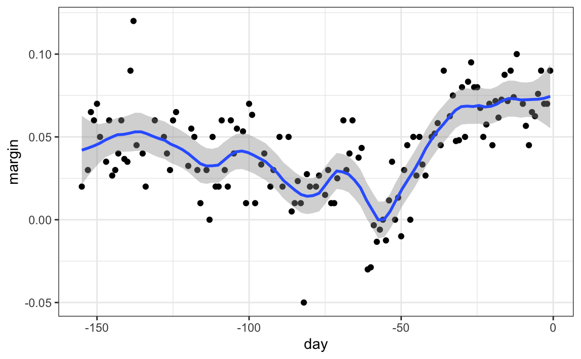
28.5 Connecting smoothing to machine learning
To see how smoothing relates to machine learning with a concrete example, consider again the example from Section 28.3.1. If we define the outcome \(Y = 1\) for digits that are seven and \(Y=0\) for digits that are 2, then we are interested in estimating the conditional probability:
\[ p(\mathbf{x}) = \mathrm{Pr}(Y=1 \mid X_1=x_1 , X_2 = x_2). \]
with \(x_1\) and \(x_2\) the two predictors defined in Section 28.3.1. In this example, the 0s and 1s we observe are “noisy” because for some regions the probabilities \(p(\mathbf{x})\) are not that close to 0 or 1. We therefore need to estimate \(p(\mathbf{x})\). Smoothing is an alternative to accomplishing this. In Section 28.3.1, we saw that logistic regression was not flexible enough to capture the non-linear nature of \(p(\mathbf{x})\), thus smoothing approaches provide an improvement. In Section 29.1, we describe a popular machine learning algorithm, k-nearest neighbors, which is based on the concept of smoothing.
28.6 Exercises
1. Compute conditional probabilities for being Male for the heights dataset. Round the heights to the closest inch. Plot the estimated conditional probability \(P(x) = \mathrm{Pr}(\mbox{Male} | \mbox{height}=x)\) for each \(x\).
2. In the plot we just made, we see high variability for low values of height. This is because we have few data points in these strata. This time use the quantile function for quantiles \(0.1,0.2,\dots,0.9\) and the cut function to ensure that each group has the same number of points. Hint: For any numeric vector x, you can create groups based on quantiles as we demonstrate below.
3. Generate data from a bivariate normal distribution using the MASS package like this:
You can make a quick plot of the data using plot(dat). Use an approach similar to the previous exercise to estimate the conditional expectations and make a plot.
4. The dslabs package provides the following dataset with mortality counts for Puerto Rico for 2015-2018.
Remove data from before May 2018, then use the loess function to obtain a smooth estimate of the expected number of deaths as a function of date. Plot this resulting smooth function. Make the span about two months long.
5. Plot the smooth estimates against the day of the year, all on the same plot but with different colors.
6. Suppose we want to predict 2s and 7s in our mnist_27 dataset with just the second covariate. Can we do this? On first inspection, it appears the data does not have much predictive power. In fact, if we fit a regular logistic regression, the coefficient for x_2 is not significant!
Plotting a scatterplot here is not useful since y is binary:
Fit a loess line to the data above and plot the results. Notice that there is predictive power, except that the conditional probability is not linear.