23 Dimension Reduction
High-dimensional data can make data analysis challenging, especially when it comes to visualization and pattern discovery. For example, in the MNIST dataset, each image is represented by 784 pixels. To explore the relationships between all pairs of pixels, we would need to examine over 300,000 scatterplots. This quickly becomes impractical.
In this chapter, we introduce a powerful set of techniques known collectively as dimension reduction. The core idea is to reduce the number of variables in a dataset while preserving important characteristics, such as the distances between observations. With fewer dimensions, visualization becomes more feasible, and patterns in the data become easier to detect.
The main technique we focus on is Principal Component Analysis (PCA), a widely used method for unsupervised learning and exploratory data analysis. PCA is based on a mathematical tool called the singular value decomposition (SVD), which has applications beyond dimension reduction as well.
We begin with a simple illustrative example to build intuition, then introduce the mathematical concepts needed to understand PCA. We conclude the chapter by applying PCA to two more complex, real-world datasets to demonstrate its practical value.
23.1 Motivation: preserving distance
For illustrative purposes, we consider a simple example with twin heights. Some pairs are adults, the others are children. Here, we simulate 100 two-dimensional points where each point is a pair of twins. We use the mvrnorm function from the MASS package to simulate bivariate normal data.
A scatterplot quickly reveals that the correlation is high and that there are two groups of twins, the adults (upper right points) and the children (lower left points):

Our features are \(n\) two-dimensional points represneting the two heights. For illustrative purposes, we will pretend that visualizing two dimensions is too challenging, and we want to explore the data through a histogram of a one-dimensional variable. We therefore want to reduce the dimensions from two to one, but still be able to understand important characteristics of the data, in particular that the observations cluster into two groups: adults and children.
To show that the ideas presented here are generally useful, we will standardize the data so that observations are in standard units rather than inches:
In the scatterplot above, we also show the distance between observation 1 and 2 (blue), and observation 1 and 51 (red). Note that the blue line is shorter, which implies that 1 and 2 are closer.
We can compute these distances using dist:
This distance is based on two dimensions, and we need a distance approximation based on just one.
If we look back at the height scatterplot above and imagine drawing a line between any pair of points, the length of that line represents the distance between the two points. Many of these lines tend to align along the diagonal direction, suggesting that most of the variation in the data is not purely horizontal or vertical but spread diagonally across both axes.
Now, imagine we rotate the entire point cloud so that the variation that was previously along the diagonal is now aligned with the horizontal axis. In this rotated view, the largest differences between points would show up in the first (horizontal) dimension. This would make it easier to describe the data using just one variable, the one that captures the most meaningful variation.
In the next section, we introduce a mathematical approach that makes this intuition precise. It allows us to find a rotation of the data that preserves the distances between points while reorienting the axes to highlight the most important directions of variation. This is the foundation of Principal Component Analysis (PCA).
23.2 Rotations
Any two-dimensional point \((x_1, x_2)^\top\) can be written as the base and height of a triangle with a hypotenuse going from \((0,0)^\top\) to \((x_1, x_2)^\top\):
\[ x_1 = r \cos\phi, \,\, x_2 = r \sin\phi \]
with \(r\) the length of the hypotenuse and \(\phi\) the angle between the hypotenuse and the x-axis.
To rotate the point \((x_1, x_2)^\top\) around a circle with center \((0,0)^\top\) and radius \(r\) by an angle \(\theta\) we simply change the angle in the previous equation to \(\phi + \theta\):
\[ z_1 = r \cos(\phi+ \theta), \,\, z_2 = r \sin(\phi + \theta) \]

We can use trigonometric identities to rewrite \((z_1, z_2)\) as follows:
\[ \begin{aligned} z_1 = r \cos(\phi + \theta) = r \cos \phi \cos\theta - r \sin\phi \sin\theta = x_1 \cos(\theta) - x_2 \sin(\theta)\\ z_2 = r \sin(\phi + \theta) = r \cos\phi \sin\theta + r \sin\phi \cos\theta = x_1 \sin(\theta) + x_2 \cos(\theta) \end{aligned} \]
Now we can rotate each point in the dataset by simply applying the formula above to each pair \((x_{i1}, x_{i2})^\top\).
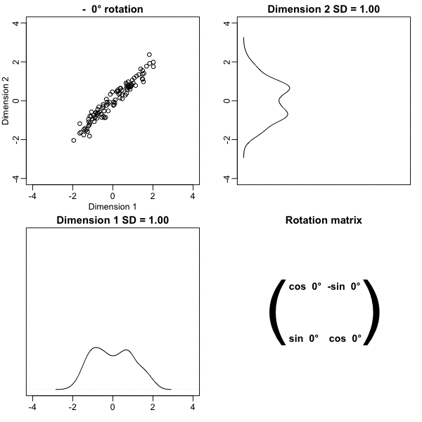
Here is what the twin standardized heights look like after rotating each point by \(-45\) degrees:

Note that while the variabilities of \(x_1\) and \(x_2\) are similar, the variability of \(z_1\) is much larger than the variability of \(z_2\). Also, notice that the distances between points appear to be preserved. In the next sections, we show mathematically that this is, in fact, the case.
23.3 Linear transformations
Any time a matrix \(\mathbf{X}\) is multiplied by another matrix \(\mathbf{A}\), we refer to the product \(\mathbf{Z} = \mathbf{X}\mathbf{A}\) as a linear transformation of \(\mathbf{X}\). Below, we show that the rotations described above are a linear transformation. To see this, note that for any row \(i\), the first entry was:
\[ z_{i1} = a_{11} x_{i1} + a_{21} x_{i2} \]
with \(a_{11} = \cos\theta\) and \(a_{21} = -\sin\theta\).
The second entry was also a linear transformation:
\[z_{i2} = a_{12} x_{i1} + a_{22} x_{i2}\]
with \(a_{12} = \sin\theta\) and \(a_{22} = \cos\theta\).
We can write these equations using matrix notation:
\[ \begin{pmatrix} z_1\\z_2 \end{pmatrix} = \begin{pmatrix} a_{11}&a_{12}\\ a_{21}&a_{22} \end{pmatrix}^\top \begin{pmatrix} x_1\\x_2 \end{pmatrix} \]
An advantage of using linear algebra is that we can write the transformation for the entire dataset by saving all observations in a \(N \times 2\) matrix:
\[ \mathbf{X} \equiv \begin{bmatrix} \mathbf{x}_1^\top\\ \vdots\\ \mathbf{x}_n^\top \end{bmatrix} = \begin{bmatrix} x_{11}&x_{12}\\ \vdots&\vdots\\ x_{n1}&x_{n2} \end{bmatrix} \]
We can then obtain the rotated values \(\mathbf{z}_i\) for each row \(i\) by applying a linear transformation of \(X\):
\[ \mathbf{Z} = \mathbf{X} \mathbf{A} \mbox{ with } \mathbf{A} = \, \begin{pmatrix} a_{11}&a_{12}\\ a_{21}&a_{22} \end{pmatrix} = \begin{pmatrix} \cos \theta&\sin \theta\\ -\sin \theta&\cos \theta \end{pmatrix} . \]
If we define:
We can write code implementing a rotation by any angle \(\theta\) using linear algebra:
The columns of \(\mathbf{A}\) are referred to as directions because if we draw a vector from \((0,0)\) to \((a_{1j}, a_{2j})\), it points in the direction of the line that will become the \(j\)-th dimension.
Another advantage of linear algebra is that if we can find the inverse matrix of \(\mathbf{A}^{-1}\), we can convert \(\mathbf{Z}\) back to \(\mathbf{X}\), again using a linear transformation.
In this particular case, we can use trigonometry to show that:
\[ \begin{aligned} x_{i1} = b_{11} z_{i1} + b_{21} z_{i2}\\ x_{i2} = b_{12} z_{i1} + b_{22} z_{i2} \end{aligned} \]
with \(b_{21} = \cos\theta\), \(b_{21} = \sin\theta\), \(b_{12} = -\sin\theta\), and \(b_{22} = \cos\theta\).
This implies that:
\[ \mathbf{X} = \mathbf{Z} \begin{pmatrix} \cos \theta&-\sin \theta\\ \sin \theta&\cos \theta \end{pmatrix}. \]
Note that the matrix multiplying \(\mathbf{Z}\) is \(\mathbf{A}^\top\), which implies that
\[ \mathbf{Z} \mathbf{A}^\top = \mathbf{X} \mathbf{A}\mathbf{A}^\top\ = \mathbf{X} \]
and therefore that, in this particular case, \(\mathbf{A}^\top\) is the inverse of \(\mathbf{A}\). This also implies that all the information in \(\mathbf{X}\) is included in the rotation \(\mathbf{Z}\), and it can be retrieved via a linear transformation. A consequence is that for any rotation, the distances are preserved. Here is an example for a 30-degree rotation, although it works for any angle:
The next section explains why this happens.
23.4 Orthogonal transformations
Recall that the distance between two points, say rows \(h\) and \(i\) of the transformation \(\mathbf{Z}\), can be written like this:
\[ \|\mathbf{z}_h - \mathbf{z}_i\| = (\mathbf{z}_h - \mathbf{z}_i)^\top(\mathbf{z}_h - \mathbf{z}_i) \]
with \(\mathbf{z}_h\) and \(\mathbf{z}_i\) the \(p \times 1\) column vectors stored in the \(h\)-th and \(i\)-th rows of \(\mathbf{X}\), respectively.
Remember that we represent the rows of a matrix as column vectors. This explains why we use \(\mathbf{A}\) when showing the multiplication for the matrix \(\mathbf{Z}=\mathbf{X}\mathbf{A}\), but transpose the operation when showing the transformation for just one observation: \(\mathbf{z}_i = \mathbf{A}^\top\mathbf{x}_i\)
Using linear algebra, we can rewrite the quantity above as:
\[ \|\mathbf{z}_h - \mathbf{z}_i\| = \|\mathbf{A}^\top \mathbf{x}_h - \mathbf{A}^\top\mathbf{x}_i\|^2 = (\mathbf{x}_h - \mathbf{x}_i)^\top \mathbf{A} \mathbf{A}^\top (\mathbf{x}_h - \mathbf{x}_i) \]
Note that if \(\mathbf{A} \mathbf{A} ^\top= \mathbf{I}\), then the distance between the \(h\)th and \(i\)th rows is the same for the original and transformed data.
We refer to transformations with the property \(\mathbf{A} \mathbf{A}^\top = \mathbf{I}\) as orthogonal transformations. These are guaranteed to preserve the distance between any two points.
We previously demonstrated that our rotation has this property. We can confirm using R:
To understand where this name comes from, recall that in linear algebra, two vectors, say x and y, are said to be orthogonal if
\[ \mathbf{x}^\top \mathbf{y} = 0. \]
If a matrix \(\mathbf{A}\) satisfies \(\mathbf{A}\mathbf{A}^\top = \mathbf{I}\), then each row of \(\mathbf{A}\) is orthogonal to every other row.
The word orthogonal comes from the Greek orthós, meaning straight or right, and gōnía, meaning angle. In two and three dimensions, one can show that vectors with zero inner product meet at a right angle—that is, they are perpendicular. The term was generalized to higher dimensions, where a right angle is defined through the inner product rather than spatial intuition.
Notice that \(\mathbf{A}\) being orthogonal also guarantees that the total sum of squares (TSS) of \(\mathbf{X}\), defined as \[ \mbox{TSS} = \sum_{i=1}^n \sum_{j=1}^p x_{ij}^2 \]
is equal to the total sum of squares of the rotation \(\mathbf{Z} = \mathbf{X}\mathbf{A}^\top\). To illustrate, observe that if we denote the rows of \(\mathbf{Z}\) as \(\mathbf{z}_1, \dots, \mathbf{z}_n\), then the sum of squares can be written as:
\[ \sum_{1=1}^n \|\mathbf{z}_i\|^2 = \sum_{i=1}^n \|\mathbf{A}^\top\mathbf{x}_i\|^2 = \sum_{i=1}^n \mathbf{x}_i^\top \mathbf{A}\mathbf{A}^\top \mathbf{x}_i = \sum_{i=1}^n \mathbf{x}_i^\top\mathbf{x}_i = \sum_{i=1}^n\|\mathbf{x}_i\|^2 \]
We can confirm using R:
This can be interpreted as a consequence of the fact that an orthogonal transformation guarantees that all the information is preserved.
However, although the total is preserved, the sum of squares for the individual columns changes. Here we compute the proportion of TSS attributed to each column, referred to as the variance explained or variance captured by each column, for \(\mathbf{X}\):
and \(\mathbf{Z}\):
In the next section, we describe how this last mathematical result can be useful.
23.5 Principal Component Analysis (PCA)
We have established that orthogonal transformations preserve both the distances between observations and the total sum of squares (TSS). However, while the TSS remains unchanged, the way it is distributed across the columns can vary depending on the transformation.
The main idea behind Principal Component Analysis (PCA) is to find an orthogonal transformation that concentrates as much of the variance as possible into the first few columns. This allows us to reduce the dimensionality of the problem by focusing only on those columns that capture most of the variation in the data.
In our example, we aim to find a rotation that maximizes the variance explained in the first column. The following code performs a grid search across rotations from \(-90\) to \(0\) degrees to identify such a transformation:

We find that a \(-45\) degree rotation appears to achieve the maximum, with over 98% of the total variability explained by the first dimension. We denote this rotation matrix with \(\mathbf{V}\):
We can rotate the entire dataset using:
\[ \mathbf{Z} = \mathbf{X}\mathbf{V} \]
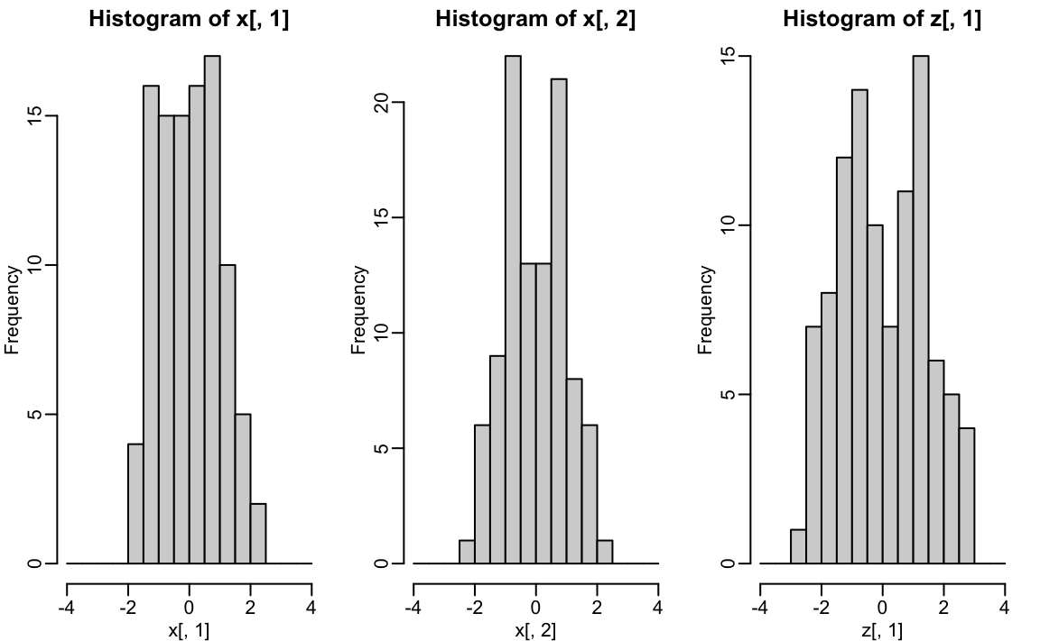
z <- x %*% VThe following further illustrates how different rotations affect the variability explained by the dimensions of the rotated data:.
The first dimension of z is referred to as the first principal component (PC). Because almost all the variation is explained by this first PC, the distance between rows in x can be very well approximated by the distance calculated with just z[,1].

We also notice that the two groups, adults and children, can be clearly observed with the one-number summary, better than with either of the two original dimensions.
We can visualize these to see how the first component summarizes the data. In the plot below, red represents high values and blue represents negative values:

This idea extends naturally to more than two dimensions. As in the two-dimensional case, we begin by finding a \(p \times 1\) vector \(\mathbf{v}_1\) with \(\|\mathbf{v}_1\| = 1\) that maximizes
\[ \|\mathbf{X}\mathbf{v}_1\|. \]
The projection \(\mathbf{X}\mathbf{v}_1\) defines the first principal component (PC1); the direction \(\mathbf{v}_1\) captures the greatest possible variation in the data.
To define the second principal component, we search for another unit vector \(\mathbf{v}_2\) that is orthogonal to \(\mathbf{v}_1\) and maximizes
\[ \|\mathbf{X}\mathbf{v}_2\|. \]
The projection \(\mathbf{X}\mathbf{v}_2\) is PC2, capturing the largest remaining variation after removing any variation explained by PC1.
This procedure continues: for each \(k\), \(\mathbf{v}_k\) is the unit vector, orthogonal to \(\mathbf{v}_1, \dots, \mathbf{v}_{k-1}\), that maximizes the variance of the projection \(\mathbf{X}\mathbf{v}_k\).
Once all \(p\) directions have been found, we construct the full rotation matrix \(\mathbf{V}\) and the corresponding principal component matrix \(\mathbf{Z}\):
\[ \mathbf{V} = \begin{bmatrix} \mathbf{v}_1 & \dots & \mathbf{v}_p \end{bmatrix}, \quad \mathbf{Z} = \mathbf{X}\mathbf{V} \]
Each column of \(\mathbf{Z}\) is a principal component, and the columns of \(\mathbf{V}\) define the new rotated coordinate system.
The idea of distance preservation extends naturally to higher dimensions. For a matrix \(\mathbf{X}\) with \(p\) columns, the transformation \(\mathbf{Z} = \mathbf{X}\mathbf{V}\) preserves the pairwise distances between rows, while reorienting the data so that the variance explained by each column of \(\mathbf{Z}\) is ordered from largest to smallest. If the variance of the columns \(\mathbf{Z}_j\) for \(j > k\) is very small, those dimensions contribute little to the overall variation in the data and, by extension, to the distances between observations.
In such cases, we can approximate the original distances between rows using only the first \(k\) columns of \(\mathbf{Z}.\) If \(k \ll p\), this yields a much lower-dimensional representation of the data that still retains the essential structure. This is the key advantage of PCA: it allows us to summarize high-dimensional data efficiently, making visualization, computation, and modeling more tractable without losing the main patterns in the data.
The solution to the PCA maximization problem is not unique. For example, \(\|\mathbf{X} \mathbf{v}\| = \|-\mathbf{X} \mathbf{v}\|\), so both \(\mathbf{v}\) and \(-\mathbf{v}\) produce the same principal component direction. Similarly, if we flip the sign of any column in \(\mathbf{Z}\) (the principal components), we can preserve the equality \(\mathbf{X} = \mathbf{Z} \mathbf{V}^\top\) as long as we also flip the sign of the corresponding column in \(\mathbf{V}\) (the rotation matrix). This means we are free to change the sign of any column in \(\mathbf{Z}\) and \(\mathbf{V}\) without affecting the PCA result.
In R, we can find the principal components of any matrix with the function prcomp:
pca <- prcomp(x, center = FALSE)Keep in mind that the default behavior is to center the columns of x before computing the PCs, an operation we don’t need in our example because our matrix is scaled.
The object pca includes the rotated data \(\mathbf{Z}\) in pca$x and the rotation \(\mathbf{V}\) in pca$rotation.
We can see that columns of the pca$rotation are indeed the rotation obtained with \(-45\) (remember the sign is arbitrary):
pca$rotation
#>         PC1    PC2
#> [1,] -0.707  0.707
#> [2,] -0.707 -0.707
The square root of the variation of each column is included in the pca$sdev component. This implies we can compute the variance explained by each PC using:
pca$sdev^2/sum(pca$sdev^2)
#> [1] 0.9848 0.0152
The function summary performs this calculation for us:
summary(pca)
#> Importance of components:
#>                          PC1    PC2
#> Standard deviation     1.403 0.1745
#> Proportion of Variance 0.985 0.0152
#> Cumulative Proportion  0.985 1.0000
We also see that we can rotate x (\(\mathbf{X}\)) and pca$x (\(\mathbf{Z}\)) as explained with the mathematical formulas above:
23.6 Examples
Iris example
The iris dataset is a widely used example in data analysis courses. It contains four botanical measurements of iris flowers—sepal length, sepal width, petal length, and petal width:
names(iris)
#> [1] "Sepal.Length" "Sepal.Width"  "Petal.Length" "Petal.Width"
#> [5] "Species"
If you inspect the species column using iris$Species, you’ll see that the observations are from three different species.
When we visualize the pairwise distances between observations, a clear pattern emerges: the data appear to cluster into three distinct groups, with one species standing out as more clearly separated from the other two. This structure is consistent with the known species labels:

Our features matrix has four dimensions, but three are very correlated:
cor(x)
#>              Sepal.Length Sepal.Width Petal.Length Petal.Width
#> Sepal.Length        1.000      -0.118        0.872       0.818
#> Sepal.Width        -0.118       1.000       -0.428      -0.366
#> Petal.Length        0.872      -0.428        1.000       0.963
#> Petal.Width         0.818      -0.366        0.963       1.000
If we apply PCA to the iris dataset, we expect that the first few principal components will capture most of the variation in the data. Because the original variables are highly correlated, PCA should allow us to approximate the distances between observations using just two dimensions, effectively compressing the data while preserving its structure.
We use the summary function to examine how much variance is explained by each principal component:
The first two dimensions account for almost 98% of the variability. Thus, we should be able to approximate the distance very well with two dimensions. We confirm this by computing the distance with just the first two dimensions and comparing it to the original:
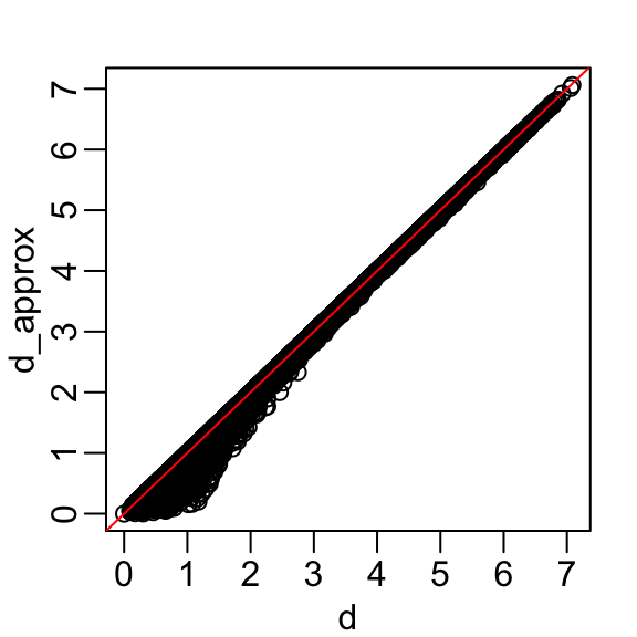
A useful application of this result is that we can now visualize the distances between observations in a two-dimensional plot. In this plot, the distance between any pair of points approximates the actual distance between the corresponding observations in the original high-dimensional space.
data.frame(pca$x[,1:2], Species = iris$Species) |>
  ggplot(aes(PC1, PC2, fill = Species)) +
  geom_point(cex = 3, pch = 21) +
  coord_fixed(ratio = 1)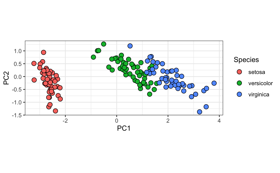
We color the observations by their labels and notice that, with these two dimensions, we achieve almost perfect separation.
Looking more closely at the resulting PCs and rotations:

we learn that the first PC is obtained by taking a weighted average of sepal length, petal length, and petal width (red in the first column), and subtracting a quantity proportional to sepal width (blue in the first column). The second PC is a weighted average all four measurements in the same direction (blue in second column).
MNIST example
The written digits example has 784 features. Is there any room for data reduction? We will use PCA to answer this.
If not already loaded, let’s begin by loading the data:
library(dslabs)
if (!exists("mnist")) mnist <- read_mnist()
Because the pixels are so small, we expect pixels close to each other on the grid to be correlated, meaning that dimension reduction should be possible.
Let’s compute the PCs (this will take a few seconds as it is a rather large matrix) and examine the variance explained by each PC:

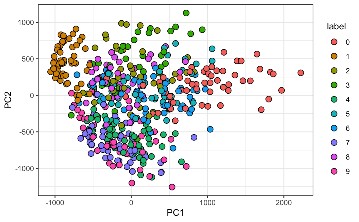
We can see that the first few PCs already explain a large percent of the variability. Furthermore, simply by looking at the first two PCs, we already see information about the labels. Here is a random sample of 500 digits:
We can also see the rotation values on the 28 \(\times\) 28 grid to get an idea of how pixels are being weighted in the transformations that result in the PCs:
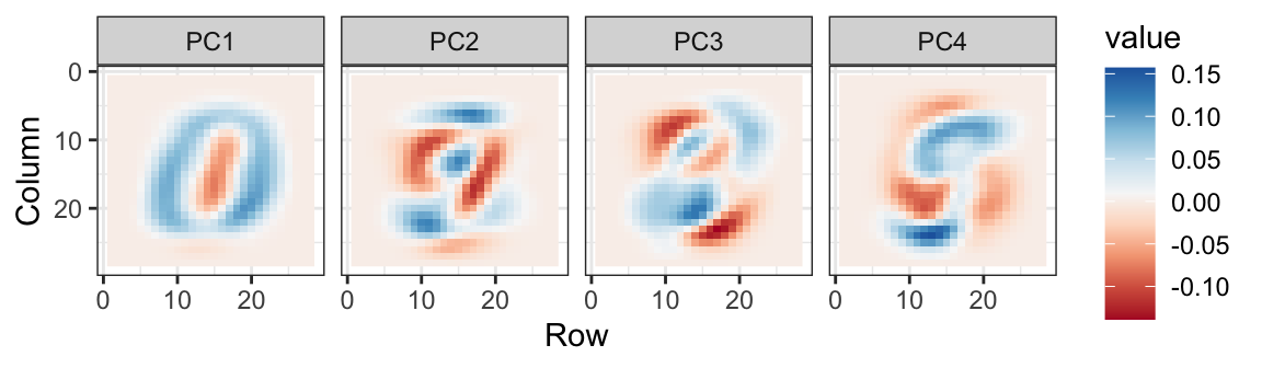
We can clearly see that the first PC appears to be separating the 1s (red) from the 0s (blue). We can vaguely discern digits, or parts of digits, in the other three PCs as well. By looking at the PCs stratified by digits, we get further insights. For example, we see that the second PC separates 7s, 9s, and 4s from the rest:
We can also confirm that the lower variance PCs appear related to unimportant variability in the last few PCs, mainly smudges in the corners:

23.7 Exercises
1. We want to explore the tissue_gene_expression predictors by plotting them.
dim(tissue_gene_expression$x)We hope to get an idea of which observations are close to each other, but the predictors are 500-dimensional, so plotting is difficult. Plot the first two principal components with color representing tissue type.
2. The predictors for each observation are measured on the same measurement device (a gene expression microarray) after an experimental procedure. A different device and procedure are used for each observation. This may introduce biases that affect all predictors for each observation in the same way. To explore the effect of this potential bias, for each observation, compute the average across all predictors and then plot this against the first PC, with color representing tissue. Report the correlation.
3. We see an association with the first PC and the observation averages. Redo the PCA, but only after removing the center.
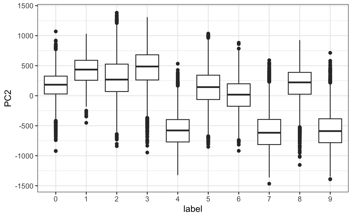
4. For the first 10 PCs, make a boxplot showing the values for each tissue.
5. Plot the percent variance explained by PC number. Hint: Use the summary function.